Tuesday, April 24, 2018

Addicted to Vignettes ...and Filters

One of my favorite things to do is putter about my apartment. I especially love rearranging my vases. I dream of having my own little boutique where I could putter to my heart's content. I was particularly pleased with the vignette I created today with two of my favorites: my moon lamp from CB2 and a graceful vintage Japanese vase.


Of course, upon completing a successful vignette, I feel the need to document it. Odd, right? But the technology allows us to take part in photographic experiments we never thought possible. So many filters are available, it's hard to choose. And these days, everyone's a photographer.

This filter is called Faded Glow on the Snapseed app. It's my current favorite. It creates moody pictures, and is perfect for rainy day shots (see a couple examples here).  What about you, dear readers? What's your favorite filter?

Monday, April 23, 2018

Shop Chic...or...the influence of a cute little purse

A few weeks ago I saw a cute purse at a vintage shop. I didn't buy it, but it's been haunting me. I have a confession to make, I am a purse addict in recovery. I've always wanted to do a wall of purses, but I've resisted, knowing my penchant to tire of things quickly.

Anyhoo...the lovely shop owner told me the purse was designed by Mary Quant. After Googling her, I must admit, I am obsessed. She is one of the most prominent designers of 60s London-based pop. A very playful, happy and exuberant trend. Here's a picture of Mary.

 
How freaking adorable is she?  I think this pic could be the influence for a beautiful color scheme. I also think this picture would be really cute as a poster.


Here's a pic of one of Mary's designs. I am in love with the pop flowers! Last week I decided to do a little retail therapy. I wanted some new happy pieces. Mary had me craving some retro mod influences.


Here's my loot influenced by Mary! All this loot was $38 at a local consignment store. Loving the orange. Look at those shoes, aren't they fab? I could see Mary wearing them.


Love this color scheme: orange, pink and turquoise.


Here's something I love, but didn't buy. How fab is this flamingo bag from Pat Catans? Would look great on my hypothetical purse wall.  I've said it many times -- I need a virtual reality machine.


I've always wanted to have my own a little boutique. That would satisfy my love of creating vignettes. It occurred to me, why should beautiful objects like purses be hid in the closet? Why not display them proudly? Afterall,  they are pieces of art. So I have my new shoes proudly displayed with a gorgeous beaded purse I found at the Goodwill. I called this new look Shop Chic. I'm sure Mary would approve.

Obliteration and Design ADD

Dear readers, there's a trend I hate in decor, and that is the amateur portrait wall. I don't understand why people enjoy walls covered in strangers. Creepy. In my own art, I enjoy the process of obliteration. (See previous post for an example). I enjoy reducing my artwork to render it deceptively simple. I also enjoying dismantling lamps and breaking vases. I don't know why I do what I do what I do, I just know that I have to.

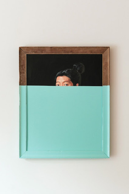
Anyhoo...I was absolutely giddy when I discovered the work of Oliver Jeffers.


Love!  I'm a big fan of color blocking. Love how the lady's eyes are peeking over a sea of aqua. Also love how the color carries onto the frame. When I saw this I wanted to buy all the crappy art at the Goodwill and cover them with paint. (P.S. The Goodwill is a great place to buy frames.)


So here's a piece I bought.


Here it is after painting. I wanted to leave a little peek of what it used to be. I hung it in my dining room. As is often the case, I grew tired of it in short order.


So...I covered it in teal paint by Valspar. BTW, I am loving sample sizes of wall paint. I actually like this. My intent was to do a wall of color blocking using various pieces from The Goodwill.


Alas, after several weeks I grew tired of the piece again. This is what's like to live with the common affliction called Design ADD. The piece felt too heavy and in changing up my apartment for Spring, I feel the need to lighten up.


So, I stripped it down further and decided to use just the frame.


I'm a lover of simplicity and geometry. I hope that one day I will arrive at the perfect arrangement in my apartment, and that I will never have to move a thing again. Ah. Surely that is Nirvana.


Friday, April 20, 2018

Spring Colors

In my post below I mentioned how much I love the colors for Spring 2018. I'm obsessed. Hot pink, pale pink, orange, peach, chartreuse, teal. I even love mixing saturated colors with pale colors. If you're trying to cheer yourself up after the long winter, add a pop of color to your place. You might even trying experimenting with a color you wouldn't ordinarily use. You'd be surprised how an unexpected hit of color freshens up a tired room. And it need not be expensive.


Have you noticed how cute outdoor furniture has gotten? I'd use any of these pieces inside. I really love the ceramic turquoise end table, I'd like to have that in my home.

Tropical prints are really hip right now. I'm not usually one for trends, but I am digging this palm leaf patterned rug. I fear I am becoming a maximalist. Images from Brylane.  BTW, I hate blogging on my Android, I don't know why I can't get my text to wrap left.


My brother and I went to Target tonight. Aren't these pillows divine? I  haven't been there in a long time. It was great to see things in person that I usually only see online. However, I was having sticker shock as well as sensory overload, Target has a lot of beautiful things for the home. I'm especially in love with their Project 62 products, but their prices have gotten high.  I did see a lamp that is haunting me, though....

Monday, April 16, 2018

It's Spring! Be bold!

Dear readers, if you are like me, you are feeling the pull to spruce up your place. It's only natural since Spring is in the air. I'm a bit obsessive about my place. Lately, I am craving color. Bright and happy colors like orange, yellow, chartreuse, turquoise. And, of course, pink. As you know, whatever color scheme I use, will always contain healthy doses of pink. I'm even thinking of experimenting with layering patterns, something I don't do very often, preferring simplicity. But I find that I'm at a stage where I want to throw caution to the wind, be bold and fearless and unapologetically me. Of course there's a ton of inspiration on the internet. Below I've assembled a collage of some beautiful colors and shapes, which give you a peek into my mind. People sure make beautiful things, don't they?


Credits:
1. Mark Rothko painting
2-4 pillows from Amazon. I am head over heels for the beaded chartreuse pillow.
5-6 lamps from Amazon
7 Ashley lamp from Target
8 fabulous blue beaded chandelier - unknown
9 Chinese inspired orange lamp designed by Meg Caswell (remember her from Design Star?  See my previous post reviewing Design Star, here).
10 blue glass lamp from Tuesday Morning
11-13 vintage pillows from one of my favorite Etsy shops, Leelaland Designs. I think these patterns look marvelous together.

What about you, dear readers? Are you busy spring cleaning? What are you doing to spruce up your place?

LinkWithin

Blog Widget by LinkWithin