Showing posts with label color blocking. Show all posts

Monday, April 23, 2018

Obliteration and Design ADD

Dear readers, there's a trend I hate in decor, and that is the amateur portrait wall. I don't understand why people enjoy walls covered in strangers. Creepy. In my own art, I enjoy the process of obliteration. (See previous post for an example). I enjoy reducing my artwork to render it deceptively simple. I also enjoying dismantling lamps and breaking vases. I don't know why I do what I do what I do, I just know that I have to.

Anyhoo...I was absolutely giddy when I discovered the work of Oliver Jeffers.


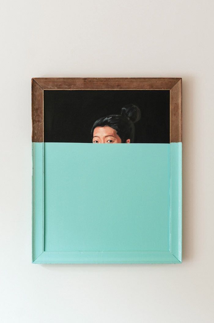
Love!  I'm a big fan of color blocking. Love how the lady's eyes are peeking over a sea of aqua. Also love how the color carries onto the frame. When I saw this I wanted to buy all the crappy art at the Goodwill and cover them with paint. (P.S. The Goodwill is a great place to buy frames.)


So here's a piece I bought.


Here it is after painting. I wanted to leave a little peek of what it used to be. I hung it in my dining room. As is often the case, I grew tired of it in short order.


So...I covered it in teal paint by Valspar. BTW, I am loving sample sizes of wall paint. I actually like this. My intent was to do a wall of color blocking using various pieces from The Goodwill.


Alas, after several weeks I grew tired of the piece again. This is what's like to live with the common affliction called Design ADD. The piece felt too heavy and in changing up my apartment for Spring, I feel the need to lighten up.


So, I stripped it down further and decided to use just the frame.


I'm a lover of simplicity and geometry. I hope that one day I will arrive at the perfect arrangement in my apartment, and that I will never have to move a thing again. Ah. Surely that is Nirvana.


Sunday, January 14, 2018

And the winners are..

After much deliberation, these are my favorite colors du jour.  And, oh yeah, if I haven't said it a trillion times...I love color blocking.

Sunday, December 21, 2014

Simplicity, Pretty Things and a Long Hiatus


Dear readers, how are you? You look marvelous! I've missed you. Hope you are having a great holiday season. I'm happy to report that I'm not participating. Ahhh. Such freedom. I'm also happy to report that I am not taking part in anything that causes me unnecessary pain, such as news, politics, dishonesty, drama. Time is too short to be inauthentic. My mother had a recent episode, which brutally reminded me of our mortality. In the blink of an eye, none of the stupid shit I worry about matters.

As I've been doing for the last several years, I've been ruthlessly editing my life. I want to live as simply as possible. No, I don't want to grow my own food, but I do want to leave a small footprint and to be free to pick up and move as I please. Don't get me wrong, I still love beautiful things, but I want just a few and I don't need anything precious. I have only four pairs of shoes, all of my paper and photos have been either shredded or put in electronic form. Things I live easily without are:  a TV, coffee maker, microwave oven.

Like many of us, I'm feeling over-stimulated and overwhelmed. I refuse to participate in the harried "crazy busy" life that is popular now. I feel a deep urge to let go, and to live. I've given up the news, and many blogs. I have a few favorites that I continue to read. I'm even questioning whether I want to continue blogging.

I'm in the process of extricating myself from Facebook. Never really liked it anyway - it mostly made me feel excluded.  I've given up most of my possessions. I know I'll be moving, I just don't know where yet. With getting rid of most of my stuff (some donated, given, tossed and sold), I confirmed something I've known for a long time. I love the freedom of simplicity. It's been a slow process, but the more I watched my apartment get cleaner, easier to keep clean and organized - the better I felt. Less weighed down. It feels lighter and airier.

Even though I am not currently decorating a specific place, I am still contemplating colors, as always. In my next place, I will be free to paint the walls. I'd love to do color blocking on the walls instead of art. The above is my most recent painting. I love these colors. Cobalt blue, silvery periwinkle blue, and of course, pink!  I am currently loving gray, cave like interiors, so would love to have a gray accent wall. I still really love the gray accent wall I did in my kitchen (see previous post here). I still love white floors.


Most of my vase collection has been sold, but here are a few in my collection. Not sure yet if I'm selling these.

That's where my head as it. I have an urgent need to unplug. To get out in nature, meditate, pray and breathe. I have been writing a lot about living simply, so there may be a book there. I don't know. It's amazing that I've been blogging almost 8 years. I didn't even know what a blog was at first, and I've never really known what I'm doing, I just jumped in. Blogging has done a lot for me. It's boosted my confidence. I've "met" some wonderful, fellow creative types who have provide incredible moral support. There are couple of bloggers I actually hope to meet, something I never thought I'd do.

So I'm feeling a little sentimental. I've decided to take a long hiatus on the blog. If you've read this post, have a wonderful holiday season and I just know 2015 is going to be the best year ever. As always, thank you for reading. I'll be spending the holidays in Colorado. This is a lifelong dream of mine - to go away for the holidays! I've never done this before so I'm really looking forward to it. Of course, I am packing light, lol!

See you sometime next year.......maybe.

Love, Peggy xo

Wednesday, January 29, 2014

Celebrating Color: Blush

Hello dear readers! Hope you are staying warm. We are experiencing a real Winter here in Ohio, the kind we've not experienced in some years and many are feeling a little blue. I'm suffering with a little bit of cabin fever, even though I'm a homebody! I have a treat planned for you!  Over the next week or so we will be celebrating one of my favorite things - Color!  Nothing cheers a body up like color. Hope you enjoy the ride and find some inspiration.

By now, we all know that Pantone's color of the year for 2014 is Radiant Orchid. This gorgeous color will be featured in a subsequent post.  For now, I'd like to talk a little about Blush, the palest of pinks. This color was immensely popular in 2013, especially when paired with gray - (see my favorite color scheme for 2013 here). Blush is a very versatile color. It looks great paired with wood or metallics. It's perfect for a soft pastel room.  It also looks great with pops of bright colors such as yellow and hot pink. I predict blush will continue to be very popular in 2014.

Blush makes a bedroom beautiful. Combined with the wood of the Heywood Wakefield dresser (BTW - I need that dresser!) and the furry rug, this room is both warm and soft.  Tracy's Vintage Modern in Manhattan via Apartment Therapy.


Blush curtains look fabulous with coral bedding and a hint of gray from the throw. Love the pale blue chair. Crate and Barrel.


A beautiful color story.  Blush ottoman, sage curtain and coral vase.  Image Elle Interior.


I love pale pink with pale blue.  Gorgeous sofa, rug, vase and lampshade!  This is definitely  not the pastels of the 80s.  Style by Marianne Luning for vtwonen.


I read that accent walls will no longer be a trend in 2014, but I don't believe it!  It's a great way to add color to a room.  I love the way they have blocked the gray over two walls in this room.  Not ready to paint a wall?  It's easy to change a room on a whim by adding accessories.  Here's a few that will work nicely and in a blush room, or to just add a little flavor of blush.  Image Planet Deco.


Thursday, June 6, 2013

Fabulous Color Scheme: Pink and Orange

So my girl Haley and I were on the phone the other day.  I was rambling on about color.  One of our favorite topics.  We often default to this topic when things get too heavy and we need cheering up.  She asked me, "How much do you think we talk about color?"  My reply:  A LOT, of course.  If you've been reading this blog for a while, you know that I am addicted.  I have experimented with many color schemes, but there is one that never fails to make me happy.  Pink and orange.  It's divine!


Genie vase at inmod;   fluo vase via hunting and collecting;   pink vase via modani;  Kate Spade Camelia Avenue posy vase via houzz.


Beautiful pink gown by Monique Lhuillier;   essential outfit for this summer, gorgeous shades of orange and coral by Matthew Williamson;  pink sleeve via sexy queen.


Orange and pink color blocks!  Image via Lonny.


Hot pink also looks great with red, as this fabulous lady proves.  Image via Coco Lee.

I am obsessed with this bedding!  That pink and orange pillow pops nicely against the black and white graphics.  Paola Navone for Anthropologie.

Tuesday, February 19, 2013

Mood Board: Light Pink

I love me some pink.  Always have.  It's been my favorite my whole life.  Usually I am drawn to hot pink, but lately I've been noticing softer, paler pinks.  I love pale pink paired with metallics, gray, and yellow.  It also looks great with turquoise and orange.  For a stunning look, mix pale pink and hot pink.  Whatever color you use, it should be balanced with lots of white.  Here's a few facts about pink:  you can never have too much;  it looks great on everyone;  it goes with any color;  it is not a strictly girly color and can be used in a thoroughly modern way.  Sometimes I think I should have written a blog devoted entirely to pink.  For Spring, I think my color scheme is going to be pale pink, yellow and gray.  Here's some inspiration, hope you enjoy!

I this room, so fresh and airy!  I adore pale pink with bright yellow and pops of gray!  I know I've told you a million times - I'd like to live in a place with all white walls and floors!  I love the copper light.  I've used pink with silver and with gold, but never copper.  This is a combination I'm seeing lately and I love it.  Dig that coffee table, wonder if I could make that.  Moody's Home.

I love these shelves from Muuto!  Really digging the pink, orange and gray.  Love the pink standing lamp. 

I keep watching the Goodwill for a credenza, but no luck so far.  Just look at this baby.  Pale pink looks great with wood too!  Love the legs, love color blocking.  I have to have this piece when I win the lottery.  Wish I could build furniture.  CBY Furniture.
I'm not usually one for plate display, but this one may be changing my mind.  I love the organic simplicity of the plates, and love the colors.  Toast via the style files.
Storage never looked so good.  I'd like to have these these in my bedroom instead of a dresser.  Pink looks great with brown - that vase looks great there.  Bungalow5 via Desire to Inspire.
And speaking of the bedroom - how gorgeous is this room!  I adore the color blocking, the gray sheets, the knit ottomans used as a night stand.  I also love the pure functionality of the clothes rack and how the head board mimics its shape.  I need some of those over sized wooden beads.  Anyone know where I can get them?  Photo by Frida Ramstedt for Trendenser.se.

Wednesday, August 15, 2012

Think Pink!

Today I read on Apartment Therapy that there are two camps of thought when it comes to pink.  Those die hard fans who love it, and those who hate it.  Obviously, I fall into the first camp.  Pink has been my favorite color my whole life.  I am mystified when I hear someone say they hate pink.  I think it is by far the most mysterious, warm, romantic, soothing and flattering color there is.  It is also the most misunderstood color, which might be why it resonates so well with me.  I've often felt like a misfit.

Pink can be used in so many ways.  Pale pink looks great with blue, black or gray.  Hot pink looks great with yellow.  Pink works great in large amounts and in small amounts.  It looks great with wood and hard industrial pieces.  A small piece of pink brings needed balance to a room.  Pink is very flattering to any one's complexion, no matter what color.  Most importantly - as I've said a million times - pink is not just a girly color.  It can be used in a thoroughly modern way as these beautiful rooms from my inspiration file prove.


I don't remember where I got this image, my bad.  Inside/Out maybe?  In any event, hot pink works very well with cool blue.  Dig the ombre treatment of that hot pink canvas.  May have to steal this idea.


A very beautiful use of pink.  Those curtains are to die for!  Image Living etc.
I love this fresh approach to color blocking.  This is my dream home office.  Image from Emily Henderson's blog, but not designed by her.  I love Emily, but she has a bad habit of not linking to her sources.  Please contact me if you know the designer of this room. 
Love the peek of pink behind the door!  Very inviting and warm.  Also love the sweetness of pink juxtaposed with the edginess of this loft.  And dig those ceramics in the right corner by Jaime Hayon!  Image via Abigail Ahern.
Love the pale pink sofa with the yellow glass table, fabulous rug and white floors!

You know I am a sucker for light fixtures.  Dig this vintage pink and gold one.  Just enough femininity balanced with just the right amount of edge.  It's perfect.  I want it.  Above two images via The Apartment.

How sweet is this corner of a little girl's room?  Coral pink is also a beautiful, soothing shade and is used nicely on the door insets.  Also check those fab over sized knobs.  Another idea I may have to steal.  Traci Fleming via Apartment Therapy.

I adore all white interiors with pops of pink, and really love the combination of hot pink and pale pink provided by the pillows.  Image via my favorite designer, Benjamin Noriega-Ortiz.

An accent wall is great idea for a pop of color.  Also love the pink and gray pillows.  Image skona hem.

I love pink in the bedroom!  The pink walls look fab with the wood floor and night stand.  Love the gray lamp, brown curtain and yellow pillow.  Pink, gray, brown and yellow make a beautiful color scheme.  Image via  vtwonen.
For a pop of hot pink in a mostly white dining room, Julie Khuu cleverly chose these inexpensive vases from Ikea.  She proves that beauty doesn't have to cost a lot.  The vases gain prominence by being used in multiples.   Love the white table and chairs, and the rug.  I am loving the organic touch of wood provided by her clever art installation.  By using multiples of the same object, she again has achieved a beautiful look that is not expensive.  She provides interest by having each figure posed in a different manner. The look is still simple due to the repetition of the same object and its geometric display.  All in all a very stunning room.

Have you ever seen a more beautiful banquette?  I certainly haven't.  Image via Desire to Inspire.

Hot pink is so sophisticated with black and gray.  I love those lamps!  I love how they are shaped differently, but made cohesive by using the same shade and spray painting in the same color.  Hmm.  May have to steal that idea.  Image via HGTV.  Pops of pink looks so sophisticated with white, gray and black as the following rooms show.
Also HGTV.
House to Home.

I dearly love this room.  This is currently my fantasy room.  Man I love the pottery, the tables and the ombre treatment of the curtains.  And the rug.  A perfect room.  Also House to Home.
Or maybe this is my favorite.  Pink sectional, low scale coffee table, black pops from the vases and art, and organic touch provided by the credenza.  Retro and modern.  In other words, heaven.  
Ditto, but add a pop of yellow in a modern, graphic painting.  These two rooms look like they could be in the same house.  Above two images Living etc.

Just a small pop of pink is provided in this hanging shade, but it is very impactful.   Love the retro-inspired shade in this largely organic looking room.  Love the green and yellow chairs and the Moroccan-inspired stove (heater?).  I usually cringe with I hear the word eclectic, but this is eclectic done right.  Although I wish they'd edit out the antlers.  I just don't like dead animals or animal parts used in decor.  Sorry.  I'm stubborn that way.  Image vtwonen.
I love these pink vases with the green credenza.  Bad blogger again.  Oops.  Please contact me if you know the source of this image.
Love hot pink with yellow!  It looks especially fabulous with the gray rug and the silver sofa.  I'm having sofa envy.  House to Home.
Love the international flavor provided by the poster.  Love the pop of yellow from the lamp.  Also love the use of color blocking here.  Nancy Riesco via sfgirlbybay.

Let's review shall we?  You can use a lot of pink or a little pink.  You can use pale pink or saturated pink.  You can even combine the two.  Pink looks great with yellow, gray, silver black, white, brown, blue and green.  Heck, pink looks great with any color.  Pink flatters anyone's complexion.  Pink is not strictly a girly color and can be used in a modern way.  If you're afraid of pink, start with a pink pillow.  I promise you will be a convert.  There's only one rule when it comes to pink:  There's no such thing as too much pink.

LinkWithin

Blog Widget by LinkWithin