Happy New Year dear readers! I hope you had a wonderful holiday season. I've seen so many review posts on my favorite blogs so felt I should do one too. A friend of mine recently said to me, "I wonder what 2014 will look like?" Interesting thought. Each year does have its own unique look, doesn't it? In the next few posts I will endeavor to show you what I think 2014 will look like. But first, let's take a look at what 2013 looked like. Here is a review of my favorite color scheme for 2013.

Dove gray, pale pink, hot pink. Added to that are a small amount of black, and a large amount of white. No matter what color scheme you choose, you should always balance it with a large amount of white. There are so many beautiful variations of pink. You may opt for a coral pink instead of pale pink - or even in addition to the pale pink for a beautiful look. Peach will also work in place of pale pink. This color scheme can be done in a soft hue or for more drama in a bold hue, or a mixture of the two. The possibilities are endless and experimentation is so much fun.
For those lovers of color, you may want to add just a pop of an accent color. Here are my favorite accent colors for 2013:
Yellow, orange, turquoise and aqua. A small amount of yellow goes a long way. Any of these colors can be used as a pop to the above color scheme, or could replace the pink (gasp!). In my humble opinion, every room needs a dash of hot pink. Color is fun, and I love experimenting with color in my apartment, and I will continue to experiment with color in 2014. For now, here are some inspirational rooms in this lovely color scheme, some soft, some bold. Hope you enjoy!
Love the softness of this room. Very restful and calm. Image via
Milieu. Fab tray tables by
Hay. Perfect multifunctional pieces that work very well in a small space.
I dearly love the pale pink walls in this room. Gray artwork and pillows add softness, while a gold ottoman and darker pink rugs add drama. Simply gorgeous.
House to Home. We will continue to see blush walls for 2014.
Love the softness of this room also. A perfect place to take a nap. Image via
Alcro.
Love the pink lounge. A perfect place for reading. Image
One Kind Design.
This pipe bed adds just the right amount of edge to this room. The chandelier is the perfect foil to the pipe bed. The room is a perfect combination of hard and soft. Pink and gray accent walls are also a great combination of hard and soft. The room is both masculine and feminine and very chic. Proving once again, what I've said a million time on this blog. Pink is not only a girly color - it can be used in a thoroughly modern way.
Simplified Building Concepts.
Pink lamp looks gorgeous against the dark wall. Image via
Gild and Grace.
I am completely smitten with this apartment. I adore the pale gray rug and the pale furniture, floors and walls. The color comes from the accessories and art. And they've gone big with the art - which I love! I could live here. You must see the rest of this home, it's gorgeous! Click
Design Hunter.
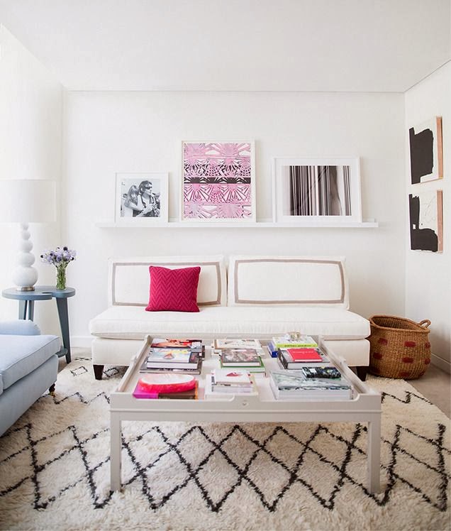
Want a small amount of hot pink? Add a pillow. Love the Moroccan wedding blanket-inspired rug. Eva Chen's apartment via
Domino.
Love the pops of of red, pink and that orange vase in this room.
Beautiful soft gray floor and cute gray furry stool. Images via
The Style Files.
Hot pink and gray sofas look beautiful together. Gorgeous pillows, art and ottoman. I'd love to edit the animal skin from this otherwise gorgeous room. Image
New Home Design Ideas.
The decorator of this room has skillfully added both ethnic and metallic touches to this color scheme. The room disparate objects unexpectedly meld together to form an elegant and, yet, cozy room. Jennifer's Pink and Lime Room via
Apartment Therapy.
Another fine example of mixing disparate objects with this beautiful color scheme.
Houzz.
This room looks modern and fresh thanks to its pale gray walls and hot pink pillows. It's a sickness - I know - but I want to edit this room. I'd like to edit the grouping of artwork on the right wall.
If I had my druthers, I'd take the grouping down and move that fab graphic orange and white painting there. That painting deserves a place of greater prominence without so much competition. Still, it's a gorgeous room.
Elle Decor France.
Simply divine pink sofa I've had in my inspiration file for a while. I'd love to paint those walls pale gray. Via Indulgy, original source unknown.
Another beautifully soft room in pink and gray.
Ministry of Deco.
This is very close to being my dream kitchen and was the inspiration for painting my kitchen gray (see previous post here). Wish I could paint my cupboard white! Image via
Desire to Inspire.

While exploring this color scheme, I found some accessories from a shop called
Leif. Lovely pot holder, tea towel, dipped spoons and vase would look great in the above kitchen.
Gorgeous room from
CB2 catalog. I love that hot pink end table.
New vases from CB2 in this color scheme.
This color scheme can be soft, or bold and dramatic like this room. I adore the pops of orange, hot pink, and blue.
House to Home.
And speaking of drama, look at this bold and beautiful bedroom! I actually found this in an ad for
DNA kiss portraits, but it was the bedding and those fab lamps that caught my eye. I am drooling over those lamps, if anyone knows the designer of those lamps, please contact me.
That's a wrap of my favorite color scheme for 2013. In my next few posts, I will be talking about what 2014 is going to look like. We are going to continue to have fun with color. Happy New Year!


.jpg)