Showing posts with label gray. Show all posts

Tuesday, January 23, 2018

Design ADD: The Story of a Little Bookcase

Here's a little secret:  I love puttering in my apartment so much that I move something almost everyday.  Even if it's just a vase or a pillow.  It's taken a while for this place to evolve. I've been really lucky, all my furniture was donated by friends and family.

My talented brother made me this sweet little bookcase.  I intended to paint it gloss white, but my bro told me to check out the mistake section of the paint department. A happy discovery indeed!  I bought a pint of satin enamel by Clark + Kensington for $1.00!  Yep, no shit. $1.00.  After sanding (which I hate) the paint went on smooth.


Bam.  I love it.  I placed the little bookcase on my focal wall.


The chair is a gift from my mom.  It's a little chunky for my taste, and I wasn't sure I liked the sage green.  It sure is comfy, though and did I mention it was free?

After studying this wall for a couple of weeks, I began to go through a familiar stage in my decorating. Panic. I love beautiful things, but I panic when I have too many.  Maybe it comes from growing up in a hoarder home (the subject of a subsequent post).  I decided the focal wall needed to be cleaner.


Yep. That feels good. It's hard to photograph my place, it doesn't get much light. But I kinda dig its cave like feel.  So where did the little bookcase end up?


In the bedroom, where it is the perfect nightstand.  Now that's what I call form AND function.  BTW, I hate making my bed.

Monday, May 16, 2016

New painting

Untitled, 2015, 18" x 36", acrylic on canvas

If you follow my instagram, you've already seen this painting. It's the last painting I did in my apartment. It was influenced by the Colorado mountains, and rain. I must say, this is my favorite painting. I've become very intrigued with reductionism in art. This painting feels like I've achieved a style and voice that all my experimentation has led to. It takes a lot of restraint to put a small amount of paint on canvas. Just as it takes restraint to decorate in a minimal way. The painting is soft, romantic and mysterious. Perfect for my new place.  My love of rain is inspiring my decorating decisions.

Wednesday, January 8, 2014

Favorite Color Scheme of 2013

Happy New Year dear readers! I hope you had a wonderful holiday season. I've seen so many review posts on my favorite blogs so felt I should do one too.  A friend of mine recently said to me, "I wonder what 2014 will look like?"  Interesting thought. Each year does have its own unique look, doesn't it? In the next few posts I will endeavor to show you what I think 2014 will look like.  But first, let's take a look at what 2013 looked like.  Here is a review of my favorite color scheme for 2013.


Dove gray, pale pink, hot pink. Added to that are a small amount of black, and a large amount of white. No matter what color scheme you choose, you should always balance it with a large amount of white. There are so many beautiful variations of pink. You may opt for a coral pink instead of pale pink - or even in addition to the pale pink for a beautiful look. Peach will also work in place of pale pink.  This color scheme can be done in a soft hue or for more drama in a bold hue, or a mixture of the two. The possibilities are endless and experimentation is so much fun.

For those lovers of color, you may want to add just a pop of an accent color.  Here are my favorite accent colors for 2013:

Yellow, orange, turquoise and aqua. A small amount of yellow goes a long way.  Any of these colors can be used as a pop to the above color scheme, or could replace the pink (gasp!). In my humble opinion, every room needs a dash of hot pink. Color is fun, and I love experimenting with color in my apartment, and I will continue to experiment with color in 2014.  For now, here are some inspirational rooms in this lovely color scheme, some soft, some bold.  Hope you enjoy!


Love the softness of this room. Very restful and calm. Image via Milieu.  Fab tray tables by Hay. Perfect multifunctional pieces that work very well in a small space.


I dearly love the pale pink walls in this room.  Gray artwork and pillows add softness, while a gold ottoman and darker pink rugs add drama.  Simply gorgeous.  House to Home.  We will continue to see blush walls for 2014.


Love the softness of this room also. A perfect place to take a nap.  Image via Alcro.


Love the pink lounge.  A perfect place for reading.  Image One Kind Design.


This pipe bed adds just the right amount of edge to this room. The chandelier is the perfect foil to the pipe bed. The room is a perfect combination of hard and soft. Pink and gray accent walls are also a great combination of hard and soft. The room is both masculine and feminine and very chic. Proving once again, what I've said a million time on this blog. Pink is not only a girly color - it can be used in a thoroughly modern way.  Simplified Building Concepts.


Pink lamp looks gorgeous against the dark wall.  Image via Gild and Grace.


I am completely smitten with this apartment. I adore the pale gray rug and the pale furniture, floors and walls. The color comes from the accessories and art. And they've gone big with the art - which I love! I could live here. You must see the rest of this home, it's gorgeous!  Click Design Hunter.


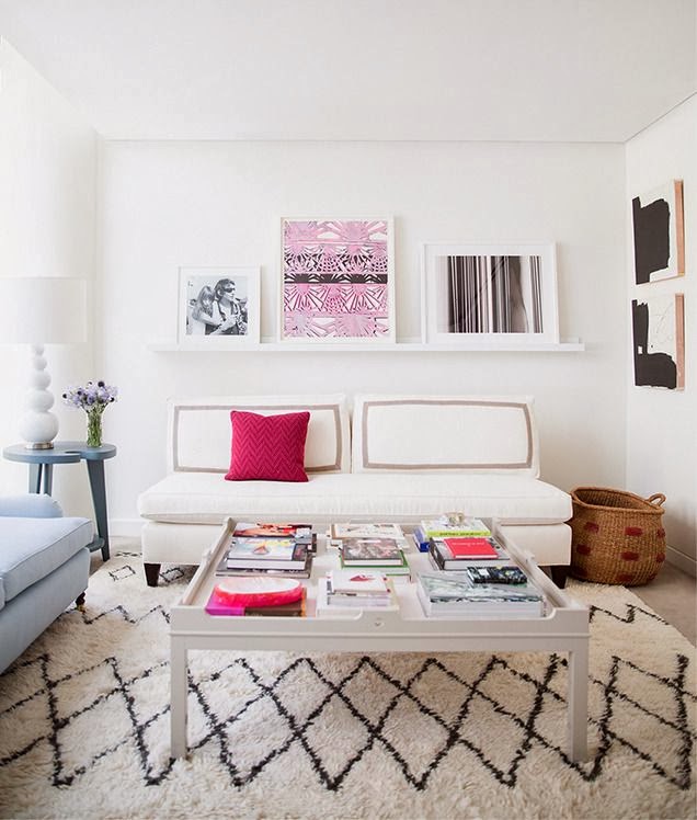
Want a small amount of hot pink?  Add a pillow.  Love the Moroccan wedding blanket-inspired rug. Eva Chen's apartment via Domino.


Love the pops of of red, pink and that orange vase in this room.

Beautiful soft gray floor and cute gray furry stool.  Images via The Style Files.

Hot pink and gray sofas look beautiful together.  Gorgeous pillows, art and ottoman.  I'd love to edit the animal skin from this otherwise gorgeous room.  Image New Home Design Ideas.


The decorator of this room has skillfully added both ethnic and metallic touches to this color scheme. The room disparate objects unexpectedly meld together to form an elegant and, yet, cozy room.  Jennifer's Pink and Lime Room via Apartment Therapy.


Another fine example of mixing disparate objects with this beautiful color scheme.  Houzz.


This room looks modern and fresh thanks to its pale gray walls and hot pink pillows. It's a sickness - I know - but I want to edit this room. I'd like to edit the grouping of artwork on the right wall.


If I had my druthers, I'd take the grouping down and move that fab graphic orange and white painting there.  That painting deserves a place of greater prominence without so much competition.  Still, it's a gorgeous room. Elle Decor France.


Simply divine pink sofa I've had in my inspiration file for a while.  I'd love to paint those walls pale gray. Via Indulgy, original source unknown.


Another beautifully soft room in pink and gray.  Ministry of Deco.


This is very close to being my dream kitchen and was the inspiration for painting my kitchen gray (see previous post here).  Wish I could paint my cupboard white!  Image via Desire to Inspire.


While exploring this color scheme, I found some accessories from a shop called Leif.  Lovely pot holder, tea towel, dipped spoons and vase would look great in the above kitchen.

Gorgeous room from CB2 catalog.  I love that hot pink end table.


New vases from CB2 in this color scheme.


This color scheme can be soft, or bold and dramatic like this room.  I adore the pops of orange, hot pink, and blue.  House to Home.


And speaking of drama, look at this bold and beautiful bedroom! I actually found this in an ad for DNA kiss portraits, but it was the bedding and those fab lamps that caught my eye. I am drooling over those lamps, if anyone knows the designer of those lamps, please contact me.

That's a wrap of my favorite color scheme for 2013.  In my next few posts, I will be talking about what 2014 is going to look like.  We are going to continue to have fun with color.  Happy New Year!

Tuesday, December 10, 2013

Mini Reveal

As promised, here is a mini reveal of my apartment with its new items.  The lamp is such a surprise, but I love it!  Such a great shape, and according to Feng Shui, every room should have something red in it for luck.  I also adore the houndstooth pillow.
 

The tweed ottoman is a bit surprising for me as well.  It's a bit masculine, but I think a little masculinity is needed for balance.  Especially with hot pink.  I love a feminine room, but I always like a little edge too.  I've been telling you forever that I want to do a gray accent wall, and here it is:


Ta da!  Talk about edge!  Here's a quick reveal of the accent wall I painted in my kitchen!  I love it!  Such a vast improvement over the super-high-gloss-muddy-puke color it was.  I don't know why landlords paint walls such awful colors, they must get a huge discount on the paint they buy.  I will be in big trouble if my landlord sees this, but I don't really know what the big deal is.  They paint every time someone moves out. And I actually did them a favor.  The walls were in terrible shape.  I sanded and smoothed the walls, and corrected a lot of the mistakes and sloppiness of the "professional" painters.  Flat paint is a much better choice than high gloss when the walls are in bad shape, it doesn't show the imperfections as much.  Of course, now that I am done with this wall, there are no imperfections.

This wall really needed a new life since the kitchen is open.  When I am lounging on the sofa I am no longer staring at an ugly wall, but a beautiful one!  I think this kitchen would be so fab if I painted the cupboards a pale gray, but I won't do that.  At least the cupboards are simple.  Now I am on the hunt for a screen to hide my refrigerator.

Monday, November 11, 2013

Square Peg, Your Curator: Gray

Today's tour in my virtual gallery is all about gray.  My love for gray developed over the years of living in Cleveland. The Lake Erie sky is always changing, always so beautiful. Especially when it's gray. Gray is easy color on the eyes and very soothing. Gray is a wonderful color to use in your environment if you are living an overly stimulated, harried life. Decorate with gray and come home to rest and relaxation. So you live in a rental, you crave gray and you're not allowed to paint? Make a statement with art. Create a serene, mysterious, romantic and ethereal environment with gray art work.

Photo of Cleveland skyline by Peggy
 

Dreamy island paintings by Haley Litzenger

Image source unknown, please contact me if you know this photographer


Above two etchings by 88editions

Reductive Gray Landscape by Matthew G. Beall

Inspiration for Fall: Gray, Pastels, Neons, Organic and Industrial

Good morning dear readers!  Hope you had a great weekend.  I have a lot of pictures in my inspiration file to show you.  For fall 2013, I am highly influenced by gray.  Gray looks fabulous in a light shade, and in dark shades.  It looks great with pastel colors and with bright colors.  It also looks great with organic accessories, and works well in an industrial chic vibe. Think all of these elements are disparate?  Think again.  The key to skillfully and flawlessly mixing these elements to create a gorgeous environment is balance. As long as you love everything you choose to have in your home, and exercise a little restraint to avoid clutter, your home will be gorgeous.

I don't use the word eclectic when I am describing decor.  It sounds non-committal to me.  Instead, I like the word collected.  That's what we do in our homes.  We collect beautiful objects.  Here are some beautifully collected rooms.  Hope you enjoy!

Seventy Nine Ideas

This room proves that gray can be light and airy.  Love the pink rug and pillow.  I need that coffee table.


Light gray sofa and light gray wall paper look gorgeous with the pastels of this room.  Add gray for an instant update on the 80s vibe.


These colors make me swoon.  Almost saturated, but not quite.  Almost pastel, but not quite.  These colors would be fabulous in a room painted a dark gray.


Here is another light and airy room.  I'd love to get in there with some gray paint and paint those walls. Almost any room that is beige or white can be painted gray to add sophistication.


Same here.  Love that sofa.


I'd love to see this room painted a pale shade of gray as well.  I'm in love with that flooring.


Here the palest of grays on the wall and floor are soft and airy.  Love the high gloss artwork.


Love the pop from the hot pink chair in this pale gray room.


Gray can be very sophisticated.


Love the pop of blue from the pillow.  Pillows are a great way to add color or change color on a whim.


I am definitely doing a slate gray accent wall in my next place.  The swan chair and ottoman look fabulous in this environment.  Love the mix of old and new here.  Love how the white plates pop off the wall.


Above three images The Style Files


Earthy, cozy and sophisticated all at the same time.  Quite an accomplishment.  Looks like a great place for a get together.


A beautiful loft featuring the works of Kevin Busta, an industrial designer from Cleveland.  I could live here.


Here's another place I could live.  Gorgeous.

A monochrome dark gray bedroom is cave like and very restful.  I'd love to take a nap there.

Living Etc.

Bright colors look fabulous with dark gray walls.  I think this is going to be my color scheme for Fall and Winter.  What about you, dear readers, are you going to be using gray or industrial elements for your Fall/Winter look?  Want more inspiration?  See my pinterest board here.

LinkWithin

Blog Widget by LinkWithin