Showing posts with label color inspiration. Show all posts

Thursday, December 6, 2018

Color Therapy, Part III - Deep Purple


Dear readers, I did a little Christmas shopping at Target today. I don't really celebrate Christmas, but found myself in the spirit anyway. I happily contemplated a coral colored pillow that was on sale, and thought how lovely it would look paired with a deep purple. Then I saw this purse display and was smitten. I didn't buy one of the purses, but the color was now firmly entrenched in my brain. Humans sure make beautiful things, don't they!

As you know, I'm happiest when I am contemplating color. I use thoughts of color as meditation, and my apartment is my lab. I've been thinking about doing an accent wall in my place for sometime. Just when I thought I had settled on gray, now I am thinking of a deep shade of purple.

I realized I've been remiss  about writing about Pantone's color of the year. I like to keep up with their color of the year, IMHO they nail it year after year.  So what is their color for 2018? Ultra Violet, a deep purple. It's a synchronicity, that their color for 2019 is called Living Coral.  (More about coral in a subsequent post).

What I love about Pantone's colors of the year, is that they look great together. Both of these colors would look great with one of my favorite of their colors. Their color for 2014, Radiant Orchid. (See previous post here.)

When I think of purples, I seldom think of dark shades. I tend to prefer lilac and lavender. (See previous post here.) And of course, I think of Jamie Drake's designs. No one uses these colors better. (See previous post here.)

So Ultra Violet. Use a lot or a little. Use it in place of gray or black to create a sultry, romantic environment. Use it in a chair or a pillow for a pop. Pair it with hot pink or yellow. Just remember to have fun. Here's some inspiration. Hope you enjoy!

Deep purple paired with cobalt blue and turquoise, gorgeous!


In a minimal room paired with wood, beautiful!


It's fabulous paired with gray.


As an accent wall.


How fabulous is the Togo sofa in deep purple?


Divine! I wish I had this sofa in my apartment.


I love this photo! This makes me want to paint one of my doors purple. I love the color combination of purple, coral pink and yellow. Man, I want that rug.


Hot pink pillow provides a beautiful pop against the dark purple. In my opinion every room should have a hit of hot pink!


Have you seen the color palette paintings by Designer Ebtihaj Khan? I love them! Even though he stole my idea, lol. I used to do striped paintings like this to explain the color scheme in my apartment. (See previous post here.) Even though I don't think art needs to match your home, I don't think there's anything wrong if it does. These would look great in any modern or minimal home. 

I hope you forgive my lack of links. All of these images came from Pinterest. Ya'll know how to do a Google image search anyway, right? As always if you know the designer of one of these rooms, please let me know. Please also drop me a line if you decide to use dark purple in your decor. If you send me a picture, maybe I'll feature you on this blog! Happy holidays! xo


Friday, April 20, 2018

Spring Colors

In my post below I mentioned how much I love the colors for Spring 2018. I'm obsessed. Hot pink, pale pink, orange, peach, chartreuse, teal. I even love mixing saturated colors with pale colors. If you're trying to cheer yourself up after the long winter, add a pop of color to your place. You might even trying experimenting with a color you wouldn't ordinarily use. You'd be surprised how an unexpected hit of color freshens up a tired room. And it need not be expensive.


Have you noticed how cute outdoor furniture has gotten? I'd use any of these pieces inside. I really love the ceramic turquoise end table, I'd like to have that in my home.

Tropical prints are really hip right now. I'm not usually one for trends, but I am digging this palm leaf patterned rug. I fear I am becoming a maximalist. Images from Brylane.  BTW, I hate blogging on my Android, I don't know why I can't get my text to wrap left.


My brother and I went to Target tonight. Aren't these pillows divine? I  haven't been there in a long time. It was great to see things in person that I usually only see online. However, I was having sticker shock as well as sensory overload, Target has a lot of beautiful things for the home. I'm especially in love with their Project 62 products, but their prices have gotten high.  I did see a lamp that is haunting me, though....

Monday, April 16, 2018

It's Spring! Be bold!

Dear readers, if you are like me, you are feeling the pull to spruce up your place. It's only natural since Spring is in the air. I'm a bit obsessive about my place. Lately, I am craving color. Bright and happy colors like orange, yellow, chartreuse, turquoise. And, of course, pink. As you know, whatever color scheme I use, will always contain healthy doses of pink. I'm even thinking of experimenting with layering patterns, something I don't do very often, preferring simplicity. But I find that I'm at a stage where I want to throw caution to the wind, be bold and fearless and unapologetically me. Of course there's a ton of inspiration on the internet. Below I've assembled a collage of some beautiful colors and shapes, which give you a peek into my mind. People sure make beautiful things, don't they?


Credits:
1. Mark Rothko painting
2-4 pillows from Amazon. I am head over heels for the beaded chartreuse pillow.
5-6 lamps from Amazon
7 Ashley lamp from Target
8 fabulous blue beaded chandelier - unknown
9 Chinese inspired orange lamp designed by Meg Caswell (remember her from Design Star?  See my previous post reviewing Design Star, here).
10 blue glass lamp from Tuesday Morning
11-13 vintage pillows from one of my favorite Etsy shops, Leelaland Designs. I think these patterns look marvelous together.

What about you, dear readers? Are you busy spring cleaning? What are you doing to spruce up your place?

Tuesday, May 24, 2016

And speaking of the blues....

As you know, I've been thinking about blue a lot lately. If you're like me (addicted to design) then you love movie sets too.  I recently watched the movie The Big Empty.  I was stunned by the beauty of this shot!

The gorgeous girl is dressed in blue and her apartment is blue. Even the phone is blue.  And will you look at that lamp!  I love it.  I would love to decorate a place in monotone.

If you love blue, you can also see a lot of blue inspiration on my board called The Blues at pinterest.  Sorry, I've been blogging on my Android and I don't know how to link yet.  It seems I'm always on a learning curve. ;)

Sunday, December 21, 2014

Simplicity, Pretty Things and a Long Hiatus


Dear readers, how are you? You look marvelous! I've missed you. Hope you are having a great holiday season. I'm happy to report that I'm not participating. Ahhh. Such freedom. I'm also happy to report that I am not taking part in anything that causes me unnecessary pain, such as news, politics, dishonesty, drama. Time is too short to be inauthentic. My mother had a recent episode, which brutally reminded me of our mortality. In the blink of an eye, none of the stupid shit I worry about matters.

As I've been doing for the last several years, I've been ruthlessly editing my life. I want to live as simply as possible. No, I don't want to grow my own food, but I do want to leave a small footprint and to be free to pick up and move as I please. Don't get me wrong, I still love beautiful things, but I want just a few and I don't need anything precious. I have only four pairs of shoes, all of my paper and photos have been either shredded or put in electronic form. Things I live easily without are:  a TV, coffee maker, microwave oven.

Like many of us, I'm feeling over-stimulated and overwhelmed. I refuse to participate in the harried "crazy busy" life that is popular now. I feel a deep urge to let go, and to live. I've given up the news, and many blogs. I have a few favorites that I continue to read. I'm even questioning whether I want to continue blogging.

I'm in the process of extricating myself from Facebook. Never really liked it anyway - it mostly made me feel excluded.  I've given up most of my possessions. I know I'll be moving, I just don't know where yet. With getting rid of most of my stuff (some donated, given, tossed and sold), I confirmed something I've known for a long time. I love the freedom of simplicity. It's been a slow process, but the more I watched my apartment get cleaner, easier to keep clean and organized - the better I felt. Less weighed down. It feels lighter and airier.

Even though I am not currently decorating a specific place, I am still contemplating colors, as always. In my next place, I will be free to paint the walls. I'd love to do color blocking on the walls instead of art. The above is my most recent painting. I love these colors. Cobalt blue, silvery periwinkle blue, and of course, pink!  I am currently loving gray, cave like interiors, so would love to have a gray accent wall. I still really love the gray accent wall I did in my kitchen (see previous post here). I still love white floors.


Most of my vase collection has been sold, but here are a few in my collection. Not sure yet if I'm selling these.

That's where my head as it. I have an urgent need to unplug. To get out in nature, meditate, pray and breathe. I have been writing a lot about living simply, so there may be a book there. I don't know. It's amazing that I've been blogging almost 8 years. I didn't even know what a blog was at first, and I've never really known what I'm doing, I just jumped in. Blogging has done a lot for me. It's boosted my confidence. I've "met" some wonderful, fellow creative types who have provide incredible moral support. There are couple of bloggers I actually hope to meet, something I never thought I'd do.

So I'm feeling a little sentimental. I've decided to take a long hiatus on the blog. If you've read this post, have a wonderful holiday season and I just know 2015 is going to be the best year ever. As always, thank you for reading. I'll be spending the holidays in Colorado. This is a lifelong dream of mine - to go away for the holidays! I've never done this before so I'm really looking forward to it. Of course, I am packing light, lol!

See you sometime next year.......maybe.

Love, Peggy xo

Monday, October 6, 2014

Mood Board: Serene Blues

Dear readers, as you know this Fall I have been falling deeply in love with blue. It's actually surprising for me, and it started as an experiment in color psychology. I want to feel serene, cool and confident, yet comfy. I've been mixing all shades of blue, from royal and electric blue to periwinkle to the more green blues like teal, turquoise and aqua. So naturally when I saw this fierce design by Christian Siriano, I about fainted.


Okay, it's from his Spring/Summer 2015 collection, but since we are seeing it now, I'm using it for Fall inspiration. I know, I know, I've mentioned a zillion times that Christian is a genius. But what can I say? The guy is a genius! His use of color and texture is unparalleled for a designer of his young years. I mean will you just look at this outfit?  Sleek royal blue top paired with big aqua skirt, then add just the tiniest acrylic purse. Ahhh. She looks adorable. Where is she going in this outfit? Why to play the cello with the orchestra, of course. After that she needs a cute, little room to relax in. I've always loved designing rooms based on fashion, and this is a room I actually want.


When you are a magnificent beauty, you don't need to many things around you, but they should all be beautiful. Furniture is actually secondary to art. Start with a comfy place to lounge, add a couple of paintings, a vase and a fabulous lamp and you have a gorgeous room. Want more layers? Add a rug, a throw and pillow.

Sources:  Man dig that over sized lamp and shade. Formerly available at The Bomb Shelter. I would've snatched that up, but I wasn't fast enough. Blue sofa also at The Bomb Shelter. Gorgeous violet painting by Cheryl Wasilow, wish I'd painted that!  Blue tree painting by the fabulous Haley Litzenger. I need that painting. Vase formerly available from West Elm.

Wednesday, September 17, 2014

Favorite Colors for Fall


If you've read this blog for a while, you know that I am in love with pink. It's my favorite color, always has been and probably always will be. But lately I've been conducting an an experiment in color psychology. Since I always feel hot, I am trying to make my place feel cool. I've been using a lot of blue. Totally new for me, and I've come to love it.

Blue is ethereal and makes me feel close to water - something I've always enjoyed.   I love all the shades of blue, especially periwinkle. I also love blue and periwinkle with purple, lilac and lavender.  And I love lilac with aqua and turquoise.


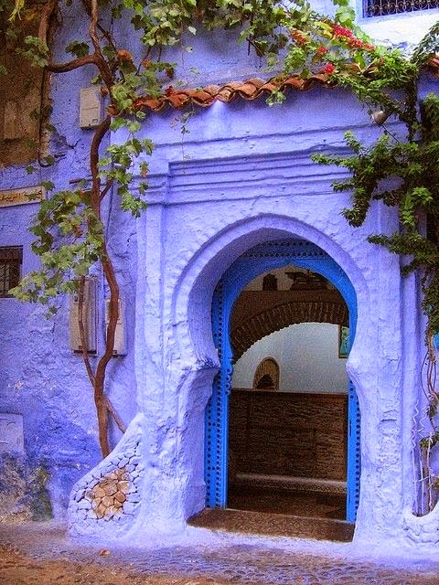
I also love these colors used in a Moroccan motif.


Celebrating Color: Teal!

Teal. It's a gorgeous color. Somewhere between blue and turquoise. Turquoise can be more green in hue, approaching an aqua.  Teal is a more bluish turquoise.  In any event, all these colors look fabulous together. I especially love jewel tones and the bright colors we are seeing this fall.


I think I need these shoes.


Love the mix of blues with the teal wall!


Teal accent wall in otherwise white space = Fab!


This last picture is of my friend Haley's kitchen. Isn't it fab? Her boyfriend painted it the most beautiful shade of teal! And check that white vase with branches on top of the cupboard. He spray painted those. I love a dude with good taste.


Remember the odd niche in my kitchen in my previous apartment?  It looks very close to Haley's color, only I used a high gloss. Great minds think alike!


Bright teal is great for a creative space.  This is Hopsin's home studio, where the magic happens.

Friday, September 12, 2014

Celebrating Color: Blue and Orange

Happy Friday dear readers!  I have some exciting announcements coming up and am swamped with work. I know, I know... it's kind of passe these days to say how busy you are. We're all ridiculously busy.  Hey, take a break. I've got some goof off material for you. Grab your favorite coffee or tea, and let's have a color therapy session. It's good, clean fun.

I apologize that this post is hastily done. My blog is about to change directions drastically, and I have a backlog of draft posts. I want to get a couple of those done, and then make my announcements. I also apologize for the lack of links. I hope this doesn't offend anyone, I will update at a later date. In the meantime, if you are the designer (or know the designer of one of the rooms below, please leave me a comment).  However, ya'll know how to Google image search, right?  If I can do it, I know you can do it, lol.

Here's some blue and orange inspiration for your Friday. Below for your pleasure are many uses of blue and orange. There are many different hues as well.  Some rooms use a pale hue, others are saturated. Some use large amounts and others use the colors as a pop.  Some rooms use blue and orange together. The possibilities are endless. Throw in lots of white, a pop of purple or a pop of pink.  As you know, pink goes with everything.  Hope you enjoy!


Have a great weekend!  If you have insomnia, my blog will be the place to be. Lots of exciting posts coming up.  I have a couple more color posts, a new fabulous artist to introduce and very exciting news.  Stay tuned!

LinkWithin

Blog Widget by LinkWithin