

Showing posts with label Designers. Show all posts
Showing posts with label Designers. Show all posts
Friday, June 30, 2017
Always Loved Pink! Always will!!!


Sunday, January 19, 2014
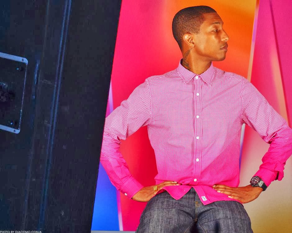
What 2014 Looks Like: Shout Out to Pharrell Williams

I'm over the moon that Singer/Writer/Producer/Designer/Entrepreneur Pharrell Williams' song Happy is nominated for an Academy Award! Congratulations on this much-deserved accolade Pharrell!
I am overly ambitious because I realize it can be done.
Pharrell Williams from his Facebook page.
This post is not meant to be an exhaustive essay on the multi-talented Pharrell Williams, but rather my personal experience of how I learned about this phenomenal artist. My appetite for all things Pharrell has merely been whetted. I predict that this cultural icon will be responsible for the biggest trend of 2014.
I first learned of Pharrell's fabulousness when I saw a feature of his Miami apartment. This happens to me a lot since I'm addicted to decorating magazines and blogs. I often first learn of a celebrity when I see their home. When I fall in love with a person's home, it encourages me to learn more about them. I was blown away by Pharrell's cutting edge art collection, so I knew I wanted to know more about him.
Among his art collection are:

A giant plush flower ball by Takashi Murakami. I adore Murakami's work, to see more of his work on this blog, see large Murakami pillows in Kanye West's office, here. I also included Murakami's work in a review of contemporary painters, here.


You know that a guy who wears pink boat shoes has got tons of mojo to spare. Above three images via Upscale Hype. Pharrell is soft spoken and laid back, and has a sexy high pitched voice. To me he is the ultimate in geek chic. And I mean that as a compliment, I adore geeks. Everything Pharrell touches turns to gold. He's very social as evidenced by his frequent collaborations. It must be thrilling to work on collabs with him. A couple of my favs are: Beautiful with Snoop Dogg, Universal Mind Control with Common. and Get Like me with Nelly and Nicki Minaj.

Image via BlackBlaBla...
Pharrell has a great sense of style. No one rocks a bow tie better. It's no surprise that he was tapped to be a guest judge on Project Runway All Stars (Season 1, Episode 9). Designers were tasked with creating an Avant Garde look with lighting technology. The winner's design will be worn by one of Pharrell's artists.

The winning design was created by Austin Scarlett. This is one of my favorite episodes of Project Runway. Needless to say, I love Avant Garde and I adore Austin Scarlett. But it was more than that - it was Pharrell's gentle judging that made me happy. I always cry when artists are criticized harshly and eliminated. As an artist who is sensitive to criticism, I understand their pain and am in awe of their bravery. It gladdened my heart when Pharrell told Austin that he is a star. Indeed. Takes one to know one.
Pharrell has written countless scores for movies, TV and spun many hits for other talented artists. So it comes as no surprise, that he's even designed clothes for the line he co-founded, Billionaire Boys Club and Ice Cream. Pharrell has been present in my life lately, almost by accident (although there's really no such thing as an accident). I recently discovered the work of fashion designer extraordinaire Ozwald Boateng. I won't say too much about Ozwald at this point because he is the subject of an upcoming post. I highly recommend the movie A Man's Story.

I'm always fascinated by the marriage of fashion and music. I enjoy seeing the process of how a designer chooses music for his runway show, and how that music flavors the movement and the clothes. While watching this movie, I heard a song that infected me. I needed to know more. After investigation, I found the song was entitled Lapdance by N.E.R.D. When I heard the song in the film, I thought I heard the unmistakable sexy sounds of Pharrell. I was correct, he is the lead vocalist and drummer of N.E.R.D. Now every time I listen to Lapdance, I can see Ozwald bobbing his head in his sexy way.
N.E.R.D. stands for no one ever really dies. Their music is a stripped down, sophisticated minimalism, an attempt to make something out of nothing. Okay, these pithy words aren't mine. Wish they were. Suffice it to say they're dope. N.E.R.D.'s influence is clear on Get Like Me. Click the link N.E.R.D. to read an amazing essay on their work. I get the sense that Pharrell loves his life and his work, and that this collab was done like many of the things he does. That is, with a grassroots flavor, and a spirit of comradery. It must be great to work with him.
Pharrell is a skilled entrepreneur. Have you heard of Quarterly Co.? Quarterly Co. is a subscription service that enables people to receive items in the mail quarterly from influential curators of their choice. Pharrell is one of the curators you can subscribe to. His theme is curiosity, and he reminds us that "it's important to live each day like a student." How fun would that be to receive a gift from Pharrell every three months? If interested in a subscription, click here (This is not a sponsored post.) He's even written a book called Places and Spaces I've Been.
How does he get the energy to do all that he does? Because he loves it. When you love what you do, it's not work. Pharrell exudes love, and love is evident in all that he does. That he has achieved success doing it is a testament to the laws of attraction. They work. Which brings me to the song Happy. If you haven't heard it yet, take a listen. I guarantee you will be bobbing your head and clapping your hands.
i am OTHER celebrates people who push society forward.
The thinkers. The innovators. The outcasts.
History has proven that it’s the rule breakers
who have the power to change the world.
24 Hours of Happy. Viewers can visit the site and they are automatically taken to the point in the video that the time on their computer reflects. At the top of the hour, Pharrell performs the song, so he appears in the video 24 times. Following his performance 14 unique cameos play in four minute intervals, all filmed in Steadicam. The performers are all unique and so lovable. The video can be watched in real time, or you can skip to a different time of day. You can even share favorite moments on Twitter and Facebook. A superb example of how the technology connects us all. For more information on 24 Hours of Happy, click here. Here's a confession - which I'm a little afraid to admit. But perhaps admitting it will hold me accountable. I'm thinking of doing a Vlog dancing to Happy. (Gasp! Fear just surged through my body.)
From the manifesto. Pharrell has also produced the world's first ever 24 hour music video, called
Can't get enough Pharrell? Me neither. Here's a twitter feed with Pharrell's quotes. Pharrell, I hope you win the Academy Award. And thanks for being an inspiration and chasing my tenacious blues away. Happy is going to be my theme song for the year.
Here's a prediction for 2014. Remember you heard it here first. I predict Pharrell will be the most significant cultural icon of the year. My dear friends, thanks for reading. And here's my wish for you for 2014:
BE HAPPY
BE OTHER
xo
Sunday, June 10, 2012
Design Star, White Box Challenge, Season 7
I'd like to take a quick break from the scheduled posting to talk about my favorite show, Design Star! Have you been watching? It's great fun (except for some of the drama and the fact that HGTV runs far too many commercials). My favorite challenge is the White Box Challenge. Designers have a chance to really cut loose and show who they are. Before I begin, let me say this: it's much easier to criticize than it is to do. I would like to applaud all these brave designers who put themselves out there. I could never do what they do! And I am really grateful they do what they do. Okay, here are some of my humble opinions.

This year my favorite entry is the box designed by Stanley Palmieri. Stanley used the drab furniture to create light sculptures. I love it! I've always wanted to create a minimal room and paint only with light. I've often wondered what I would do in this challenge, and I think I'd create something blindingly white. Stanley didn't win this challenge because his first camera challenge was less than impressive. But hey, the amazing David Bromstad (Season One winner) was not always the seasoned professional he is now, David wasn't that great on camera at first. It's been great fun watching David grow. I hope Stanley can step up his game a little. He might start by getting a hair cut. Sorry, Stanley. Just sayin'.
This season is different from past seasons because many of the designers had very strong starts. Karl was the one to watch last season (and in my opinion should have won). This season it is the ladies who dominate. My prediction for final four: Danielle Colding, Britany Simon, Bex Hale and Rachel Kate. My favorite to win: Danielle Colding.

Here is Rachel's white box. I'm a little worried that the judges have chosen Rachel as their pet. She was the winner of both episode 1 and 2. I do dig the back wall layered with the chevron dressers. The graphics are executed with a high level of skill.

And I really dig her fashion illustration, but the rest of the room falls a little flat to me. Great job, but not worthy of the win in my humble opinion.

Here's her room from episode 1, which also took the win, and again I disagreed with the judges. She painted the black accent wall and hung the moose head on it. The judges gushed incessantly about it. I am probably biased on this point. I've seen it a million times and I was over it the first time I saw it. Taxidermy whether real or faux makes me want to barf. C'mon at its worst it glorifies dead, hunted animals. At best it is boring and over done.

This is Danielle's room from episode 1. She definitely should have taken the win. This was a huge task! She conceived of this room almost single handedly. Love the gorgeous color, the layout, the art and accessories. Love how the blue accent wall is repeated in the pillows. Love the balance. I am not a huge fan of the applied moldings. But having watched the show many times, I knew the judges would ding her if she did not deal with the verticality of this room. Astonishing beginning.

Here is Danielle's fabulous white box, inspired by a photo of her mom from the 70s. Again, I felt Danielle should have taken the win with her sleek, cool, glam room. How many times have we heard Vern say to make things look expensive? She did that with spray painting the sofa and with the gold touches. How many times have we heard Vern say to wrap a graphic around the corners of the walls? She has obviously watched the show. The lamp was an unfortunate last minute touch, but hey it's a small detail in an otherwise amazing room. And her camera challenge - she nailed it! She's incredibly poised. I like that. I'd watch her show.
 Ya'll now I am a lamp tramp. I am always amazed by the custom lamps on Design Star. Luca is one of my least favorite contestants. He talks with such bravado and then does not deliver, nor can he articulate his thought process. I expect he or Hilari will be next to go. I probably would have sent him packing this week. That said, the custom hanging lamp he designed is gorgeous, I could see this in Danielle's room.


Here is Britany's room from week 1. The room was largely conceived of by her. Mikal was paired with her, but really rode her coattails. I love the 3D graphic on the wall and the color scheme. Animal skin rug, yuk. Faux ram heads over beds, yuk.

Here is Bex Hale's white box. I am in love with those cut PVC pipes. I'd like to make a room divider similar to that. Man, I wish I were handy! I adore Bex. Her personality is sweet and engaging and she looks adorable in her hats.
One thing is for sure when it comes to Design Star. I really prefer the individual challenges. Oftentimes, design suffers when they pair up designers, and there are some difficult personalities that I would not want to work with: Kris, Luca and Stanley. I am looking forward to next week. The designers will be creating an office space for the Kardashians. It will be interesting to see who is paired up. Danielle and Rachel would be a formidable, unbeatable team.
I was really sorry to see Jordan go. He's such a cutie and I love his style, but when it came to the white box challenge it's like he gave up. Here are my predictions: Next two to be eliminated are Luca and Hilari. Neither have impressed so far. Followed by Kris and Mikel. Not sure about Miera yet. Hope Stanley can step up his game. Final four: Danielle, Bex, Britany and Rachel. Final two: Danielle and Rachel. Winner: Danielle.
Have you been watching, dear readers? What's your take on this season? Who is your favorite so far? To see my comments on the previous six seasons of white boxes, click here.
Monday, May 14, 2012
Got Legs? Part Two
In my post below, I featured a beautiful apartment where all the furniture has legs. I love the look of elevating the furniture from the floor. It makes a place look airy. That's why I am in love with my Danish sofa. I adore ottomans with legs and bookcases with legs. Turns out I am not the only one obsessed. Here are some great ideas if you need add or show off legs in your place.
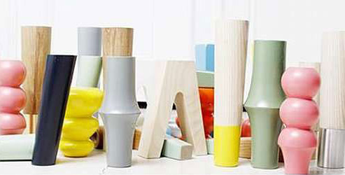
I love this idea! Custom legs for Ikea furniture by Pretty Pegs. Those pink ones are pretty sweet. Would be fun to make a coffee table using those.

I've been seeing this look a lot lately, where it looks like the legs have been dipped in paint. I especially love when it looks like they have been dipped in a neon color.

Also love the look where the legs are exposed. Kind of like the chair is wearing panty hose. Sexy. Above two images Koskela via My Attic.

Here the top of the leg is left exposed. Love the injection of hot pink with the the wood and neutral color scheme. Image via The Style Files.

Here the top of the leg is painted the same color as the table top, and the bottom is exposed. I love the white and the peak of the real materials the table is made of. I adore this table, I'd like to have it for my work desk. It's not often I see a table I like as much as the Parsons. Image via Koskela.

Designer extraordinaire, Anna from Door Sixteen is a master at injecting hot pink into her mostly black and white home. She painted these legs on her sofa. I'm thinking about copying this idea.

Here's another great idea called the Tick System by designer Jacob Schenk. The legs are wire sculpted into a pure form. They can be easily hooked onto any piece of wood to make a simple looking table. Another great idea in sustainability. I love them. I hope we will be able to get these in the U.S.
Monday, August 1, 2011
Design Star Obsession - Six Seasons of White Boxes; a Lot of Opinions; Tips for Design Star Wannabees; a Few Extras and a Whole Lot of Fun
I'm obsessed with Design Star. Like most things in my life, I was late to this obsession. I didn't discover Design Star until Season 5. I had already been watching David Bromstad and Antonio Ballatore (both of whom I adore), I didn't realize they were Design Star winners. I'm not a fan of reality TV, but after watching my first episode of Design Star, I was hooked. During a week-long illness, I was grateful the previous seasons were on the HGTV website in their entirety. Since I couldn't get off the couch, I caught up on the previous seasons. Talk about making a positive out of a negative. Since cable TV is not in my very-restricted budget, I still watch the show exclusively on their website. This takes supreme control on my part. On Monday, I'm very tempted to attend the Twitter party and look at the blogs, but I don't want any spoilers! Fortunately, HGTV is getting the episode on their website pretty quickly on Tuesday. Thanks HGTV!
Before I start posting some photos and dishing some of my opinions, I'd like to say thank you to the designers who appear on this show. You are so brave - putting yourself out there and making yourself vulnerable. I understand why you cry, because you are so passionate about your art. I must admit, I am a cry baby, I cry every week! Even when I agree with who should be eliminated, it still makes me cry.
The most iconic - and my favorite episode - is the White Box Challenge. The designers are given an unusual and very limited place to shop. The most important thing to remember is not to be literal in the treatment. Most
designers do some kind of graphic paint treatment or mural. Murals are a funny thing on Design Star, sometimes the judges like them, sometimes they don't. The judges say: Go Big or Go Home. Don't play it safe. Step outside your comfort zone, but execution must be perfect. This last statement seems like a contradiction to me. In the real world of design, you have professionals to help you with execution. We soon learn that the TV design world is very different from the real design world. I'd love to see Vern, Genevieve - and most especially Candice - do a white box challenge, with the same restraints the designers face. I'd especially love to see Candice get dirty. On her show, she has a large budget, and a lot of people to do the work for her.
I always wrack my brain to think what I would do with the limited
resources they are given, and usually can't think of anything. I'd probably go for
something unexpected and make it absolutely blindingly white. This is
really an art challenge more than it is a design challenge. Here are a
few of my favorites from past seasons. I think these white boxes would make a great installation exhibit at a gallery.
Please forgive me for some of the poor images. When I couldn't find images on the web, I photographed them from my computer. This was necessary at times to illustrate a point, I'll think you'll get the idea. Also, please remember these are only my opinions, criticizing is a lot easier than doing. I could never put myself out there the way these brave designers have.
Season 1
In Season 1, there were two girly-girls named Donna and Temple, who argued a lot. Okay, we get it Temple, you're gorgeous, but the arguing was tiresome. Not as tiresome as hearing Vanessa say "Glamalistic," however. For their white box challenge, Donna and Temple had to shop at an automotive store, and honestly, they both rocked it.
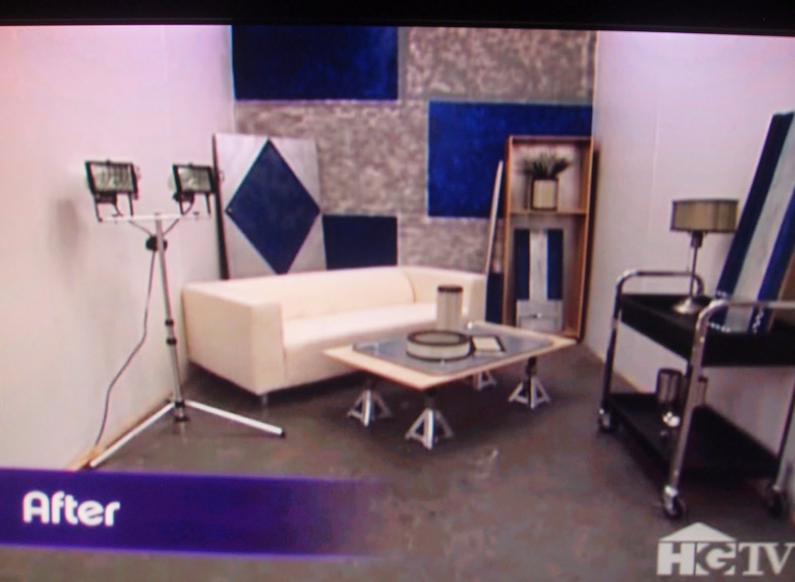
Here's Donna's room. The judges really gave Donna a hard time throughout her tenure about using too many tchotchkes (the hardest word in the English language to spell). I'd edit this room a bit, but it's still pretty great. Love her coffee table and lamps. I'd edit the book case out and straighten the sofa. I hate sofas on an angle.

Love the lamp made out of an air filter (I think). Ya'll already know I love me some lamps. All in all a great job.

Temple rocked it too. Her's is a little more streamlined, so more successful with the judges. I've always wanted to do a room in auto parts since my brother is a car buff. These ladies have proven it can be done with style.

Teman shopped at a camping store. This season paint was not provided, the designers had to set aside part of their budget for paint. At the last minute, Teman realized he had not set aside money for paint, but he got resourceful with tape on the wall. I thought the graphic was cool. I actually loved this room, it didn't scream camping store to me. Teman was eliminated for this room, and I wholeheartedly disagree with the judges. This was one of the most tearful moments in Design Star history. Teman was standing at elimination with his twin brother, Teran. They cried. Judge, Cynthia Rowley cried. I really came to love Cynthia for her sensitivity and kindness.

Here is Teman's room, which is a little unimpressive. I love the paint treatment, which I think was done with gold hair gel.

I also love the lamp. He put panty hose over the lamp shade, which I admit is the influence for my own panty hose lamp shade (see previous post here). I want to do more experimenting with hose and shades.

Tym had to shop at a pet store. I love edge, but i must admit the leash hanging from the ceiling was a little too edgy for me. Tym stated he was influenced by Warhol, but I think the influence looks a little more like Robert Mapplethorpe. I still think the room is pretty rad, love the deconstruction of the dog cages, the dog food labels as art and the coffee table. I gotta give Tym props for taking his design to the extreme.

David Bromstad, the winner of of Season 1, also shopped at the pet store. His room was absolute genius, of course. David was a sure winner from the beginning. He was stellar throughout the competition and remains stellar in his show. I've written about David on this blog several times. I love his designs, and I wish I could paint like him! If you didn't watch Season 1, you simply must see David's solution to the glass house in the final competition. It was a sculptural, Zen masterpiece perfectly incorporating inside and outside. I couldn't get a clear shot of it, click here for the full episode on HGTV.com.


The lanterns he used in the room were to die for! Thanks for always being such an inspiration David! It was not a surprise that David won Season 1. His show is called Color Splash, and it's always great fun.
Season 2
One thing that is clear to me, the White Box is the time to shine as an individual, the rooms don't have to be functional and are more like art installations. The challenge where the competitors design their living space is about team work and functionality.

In Season 2, unfortunately Lisa didn't realize this and was eliminated too soon, in Episode 1. This is always a devastating blow for a designer. She worked as an individual on the home challenge - a big mistake - and infused her sensibility too soon. I get it, though. As an artist you are so excited to show who you are. She wanted to show her rock/punk industrial lounge style. She made the coolest phone book sculptures, but again, that's art not design. Unfortunately, this didn't succeed as this was an area that was non-functional. I think this would have been successful had this been the white box challenge. Still, she was sent packing too soon which made me wonder if her crazy skunk hair do played a part. Organic Josh really deserved the boot this week.
The White Box Challenge showcased a couple of rock stars. For this challenge the designers all had to shop at a 99 cent store.

Todd! Cowabunga dude! Todd totally rocked all season long. Scott said his favorite tool is a Todd, and I have to agree. Todd can design, build, and his infectious joy of life was great to watch! He made it to the finals, and I was flabbergasted that he lost to Kim Myles. Fortunately, Todd now has his own show called Room Crashers. I haven't gotten to watch it yet, but am looking forward to when HGTV uploads it to their website.

Robb really rocked it too. I love this color palette and love the coffee table turned light alcove with the graphic continuing on the sofa. I've seen this design copied like a zillion times in magazines. I'll do a post on this topic at a later date. Unfortunately, Robb is one of those designers whose arrogance and meanness got in his way. Here's a lesson for future competitors. No one wants to watch arrogance and meanness. Control your temper, get your point across without steamrolling.

I also thought Will's room was astonishing. Modern colors, clean lined, definitely doesn't look like he shopped at a 99 cent store. I love the repetition of the chip and dip plates. I loved Will's soft demeanor. I hope to see more from him in the future.
Season 3
I'm sorry to say that Season 3 was the most boring of the seasons. No one really impressed as a TV designer on this season. Matt Locke was a standout with his exceptional construction skills, but surprisingly lost the competition to Jennifer Bertrand. Here's a look at their white boxes. Again - sorry for these poor pictures.

The designers had to shop at a craft store. Jennifer's inspiration was Italy, so she did a mural inspired by Italian ceramics. The judges loved it. Murals. They're funny. Sometimes the judges love them, sometimes they don't. There seems to be three rules to murals: they must be perfectly executed, they must be large and wrap around more than one wall and don't become a one trick pony. Don't do murals over and over again.

This is Matt's room inspired by Thailand. This is a tricky one. The judges like when designers think conceptually - just don't get too conceptual or it becomes too "obtuse" (Candice Olsen's word). This is a representation of a Buddhist temple. I think it might actually have benefited from a couple of tchotchkes. Does the craft store have an outdoor area? I think a couple of large outdoor sculptures, like maybe two large Buddhas on either side flanked by palm fronds, or even foo dogs, would've made it look less obtuse. Matt has appeared on the show HGTV Showdown, I'll suspect we'll be seeing more of him.

I think this one is a little obtuse as well. But it was my favorite this season. This room was designed by Stephanie and is influenced by Mexico. She decided to construct a poolside cabana at night. I think it's lovely. The judges liked it too. I was sad when Stephanie was eliminated in a later episode, I found her very likable and would enjoy seeing more from her.
Season 4
The plus side of Season 4 is that they amped up the talent by 1000 percent. The downside is that Cynthia Rowley and Martha McCulley were replaced by Genevieve Gorder and Candice Olson. I really missed the kindness of Cynthia and Martha, and I could never quite watch Genevieve or Candice's shows the same way after that. Their criticism is often very good, but so condescending.
This was the season with rock star designer and all around cool guy, Antonio Ballatore. It was obvious from episode 1 that no one could touch him. I adore Antonio and have written about him many times on this blog. Antonio's toughest competition came from Dan. Designers who are able to build have a distinct advantage on Design Star. Those who don't have these skills often struggle when it comes to execution. Antonio and Dan made a formidable team in episode 5, but a couple of times Dan proved to be flighty and didn't seem to stand firmly behind his decisions. Antonio and Dan face off in the final challenge and they both design beautiful spaces. I think Dan deserves a show as well. He has an online show where he designs children's rooms, but it's not really enough to showcase his talent.
Surprisingly, Antonio didn't shine in the White Box Competition, but it was his only misstep. Dan won the challenge, and I disagreed with the judges' decision. His room was fascinating, just not aesthetically appealing to me. In Episode 1, Dan worked on a dining room with Nathan that was fabulous! Nathan did a graphic mural that was successful because it wrapped around several walls and the floor (Vern loves that) and then was tempered by some linear wood.

In my opinion, Nathan should have won the white box challenge. For this challenge, the designers had to shop at a grocery store. Nathan did the most amazing paint treatment with milk. He also made a beautiful chandelier with orange slices! Love it. Nathan is extremely strong in Episodes 1 and 2, and then fails to impress after that. Not sure if the kitchen challenge ruined his confidence. The kitchen challenge is far too difficult - to the point of not being fair. Perhaps Nathan will need to mature a little, I believe he was the youngest designer. I'd love to see more of him in the future.

This is the room designed by Jenn. Jenn really got the shaft. She was sent home. I love this room. She called it Japanese Eco inspired. She definitely has the green going on, and I love the upcycling with the Japanese labels.


Not a surprise that Antonio won this Season. His show is called The Antonio Treatment. It's rad, just the kind of show HGTV needs more of. Not sure if there's going to be another season. I hope so!
Season 5
Like I said, I discovered Design Star at Season 5. I'm always late getting to trends. I had never watched reality TV before, so I was shocked. I could not believe the meanness! I cried when designers were eliminated, even when I thought their designs warranted it. I missed the clippy humor and grace of Clive. I could not believe how mean the judges were and how designers (Nina) bullied each other.

As far as her white box goes - I know this goes against the popular opinions - but it was my favorite!!! The designers had to shop at a Chinese market, and every one else's rooms looked too literal. Emily's was the only one that might have had you guessing where she shopped. I love the lamp, I love the sparseness of the room. I even love the little banal vignette on the table. And I think the art is really cool. This is a room she designed for Michael, and given his love of repurposed, found items I thought it represented him pretty well. Nina won this challenge, and did not deserve to win. Her room looked like it was designed for a nine year old girl, not a man who loves to travel. I actually thought Alex deserved to go home. Alex did not impress me at all in the competition, except for - you guessed it - a mural he did for the firefighters. Alex's execution was terrible in every competition and he never carried his weight. But wouldn't you know it - he nailed every one of his hosting challenges. I think TV is his medium, but his design needs improvement. On the flipside, Michael is a design talent, with poor hosting ability. For some reason he comes across insincere. I think he can work on this, I hope we see more of him in the future.
It was not a surprise to me that Emily was the winner of Season 5. Emily's show is called Secrets from a Stylist, and though her style is very different than my own, I enjoy watching it. Emily's blog is also a lot of fun too.
Season 6
So here we are to the current season. I still miss Clive. Tanika needs a little work on her elocution. I love the addition of David Bromstad as their mentor. The judges must have read the blogs last year, they are being a little nicer. There are so many likable designers this
year - here's my run down. Remember these are just my opinions and are
to be taken with a grain of salt. Feel free to disagree with me in the
comments!
Cathy is the Nina of this season. But the designers have learned from the previous seasons and they are not letting her get away with it. Leslie is an absolute saint in Episode 1, Cathy is down right mean and Leslie lets it "in one ear and out the other." Cathy's artifice is really getting in her way. She's an emmy winning reporter and has that stiff reporter elocution that drives me crazy. If I hear one more time that she's got a global perspective, I will vomit. Honestly, honey, you are not the only person to have ever traveled. And if I hear the judges say "great coffee table" one more time, I will again - uh - vomit. So what - you can buy a coffee table! Design and build a coffee table. Maybe I'll be impressed.
Although, I must admit the coffee table Leslie bought in Episode 1 is amazing. It's made of tires! I love upcycled art. At first I thought I wasn't going to like Leslie because she had been a cheerleader, but I do like her. Believe it or not, she actually has a very understated, demure way about her. I like Meg's personality, but not her style so much. Kelly kind of bores me (sorry).
.
Cathy is the Nina of this season. But the designers have learned from the previous seasons and they are not letting her get away with it. Leslie is an absolute saint in Episode 1, Cathy is down right mean and Leslie lets it "in one ear and out the other." Cathy's artifice is really getting in her way. She's an emmy winning reporter and has that stiff reporter elocution that drives me crazy. If I hear one more time that she's got a global perspective, I will vomit. Honestly, honey, you are not the only person to have ever traveled. And if I hear the judges say "great coffee table" one more time, I will again - uh - vomit. So what - you can buy a coffee table! Design and build a coffee table. Maybe I'll be impressed.
Although, I must admit the coffee table Leslie bought in Episode 1 is amazing. It's made of tires! I love upcycled art. At first I thought I wasn't going to like Leslie because she had been a cheerleader, but I do like her. Believe it or not, she actually has a very understated, demure way about her. I like Meg's personality, but not her style so much. Kelly kind of bores me (sorry).
.
This season for me, is all about the men. I think Mark will go home
soon, he's just not a fighter. This is not a criticism, I actually like that
about him. Teams are going to be a problem for him. Doug really tramples on him in Episode 3 and the design suffers greatly. Doug is sent packing and deservedly so. I'd like to see more individual challenges, but I
suppose team challenges are a necessary time saver. I'm not really
interested in Kevin. I was not as enamored with his White Box as the
judges were, but I love his design in Episode 3. I just don't think I
would watch his show. Maybe his hosting skills will improve over the
season and he will change my mind. Remember - it's much easier to
criticize than to do what they are doing. I could never compete on
Design Star. I have much respect for all of them!
I am really interested in Bret, Tyler and Karl right now. Here's their white rooms.

This year the designers were standing by a graffiti-bombed building while they were given their instructions. They were told they would be shopping at a restaurant supply warehouse. This is the room Bret did. Vern called it "bunker chic." I think it's pretty rad, but I don't think the judges got the bombing reference. I also really like how orderly it is.

This is Karl's room, and I kinda love it. Karl won week one's challenge by painting a mural. A mural which was successful because it was executed perfectly and made a small room look taller. Genevieve said, "We already know Karl can paint, I was hoping to see a new super power." Her criticism can be so informative, but she can also be really catty. I actually love the Mondrian color blocking technique in this room, especially how it carries from the walls to the furniture. (I recently wrote about my interest in color blocking, see previous post here.) I would like to design a room with color blocks - instead of art - and then experiment with how different lighting affects the colors. I also think this color palette is gorgeous.

The chandelier he made from to go cartons is gorgeous!!! I want to make chandeliers! I wish I had Karl's skills.

This room is designed by Tyler. Mark won the challenge this week, and even though his piece was amazing, I disagreed with the judges. In my opinion, Tyler is the winner of this competition hands down. Tyler, very smartly, got rid of all the mundane furniture immediately. His upcycled chair/light is made from water bottles. It's graphic and has a green perspective. I love that the room really packs a punch with a small amount of elements. The chair was so strong, it needed to speak on its own without competition from too many elements. This is what the judges call the "Big Wow Factor." This is definitely a piece that should be in a gallery. Great work Tyler!

I cried when they sent J home - I told you the show makes me cry every week. I really wanted to see Cathy go home. J was missing the Big Wow Factor. Her big concept - a fire box was too small. And she totally winged her hosting challenge. She was kind of laid back, like Emily. Maybe HGTV doesn't need another Emily, just sayin'. Don't get me wrong - I love Emily. Meg's room was kinda bad, and I felt sorry for her when her table broke at the last minute. I think her hosting saved her. I do think J's floor is really pretty and I wish I knew more about how she executed it.
I'm absolutely fascinated by Tyler, Bret, and Karl. I find all three of these guys extremely kind, smart, funny and very, very watchable. Here are some photos from Episode 3 where Bret and Karl were teamed with Cathy. Cathy tried to pull rank thinking she was superior, but luckily the guys didn't let her get away with it. They showed a lot of moxie and I gotta give them props for doing it in a tactful way.


I really had a lot of fun, writing this post. I hope you enjoyed it as well and would love to hear your opinions. What about you dear readers, who is your favorite designer? Are you hooked on the show too? When are some of the times you have disagreed with the judges? Who would you like to see more of?
Subscribe to:
Posts (Atom)
LinkWithin
