Showing posts with label hot pink. Show all posts

Saturday, January 13, 2018

Feeling Blue

A few of my favorite colors are: periwinkle, cobalt blue, berry pink and hot pink. Paolo Lenti is skilled at using these colors. I dropped my jaw when I saw these divine spaces.
Omigod. I love the idea of a monochromatic space, with a dark cave-like feel. These blues feel so rich, and are a great alternative to gray (which I still love, but is getting a little played out).

Reminds me a of Prada's use of jewel tones.  (See my previous post featuring one of my favorite rooms of all time featuring Prada fabrics, here.)  Dig that fabulous crochet rug by one of my favorite designers, Patricia Urquiola (another of my designed by Ms. Urquiola can be seen here). Makes me want to take up crochet again...almost. The last thing I need is another obsession. I mean, have you been down the yarn isle at Pat Catan's? It's heaven, but I know that damn yarn would sit in the closet and taunt me about how much money I've spent, lol.  Also dig that living wall, but..I have a brown thumb.

Swoon. One of my favorite color schemes.  Berry pink and light blue (see previous post here).  Their use of color is divine. If you love color, you will love their instagram page, here. Of course if I went this scheme, I would need these fabulous dishes from Urban Outfitters. Man, humans sure make beautiful things don't they?  No wonder we Americans are always broke.
Though I am totally smitten, this color scheme is not to be. It would involve too much starting over which is not possible on my teeny tiny budget. I don't need a million dollars, I need a virtual reality machine! Then I could change my decor based on my mood.  xo

Wednesday, January 8, 2014

Favorite Color Scheme of 2013

Happy New Year dear readers! I hope you had a wonderful holiday season. I've seen so many review posts on my favorite blogs so felt I should do one too.  A friend of mine recently said to me, "I wonder what 2014 will look like?"  Interesting thought. Each year does have its own unique look, doesn't it? In the next few posts I will endeavor to show you what I think 2014 will look like.  But first, let's take a look at what 2013 looked like.  Here is a review of my favorite color scheme for 2013.


Dove gray, pale pink, hot pink. Added to that are a small amount of black, and a large amount of white. No matter what color scheme you choose, you should always balance it with a large amount of white. There are so many beautiful variations of pink. You may opt for a coral pink instead of pale pink - or even in addition to the pale pink for a beautiful look. Peach will also work in place of pale pink.  This color scheme can be done in a soft hue or for more drama in a bold hue, or a mixture of the two. The possibilities are endless and experimentation is so much fun.

For those lovers of color, you may want to add just a pop of an accent color.  Here are my favorite accent colors for 2013:

Yellow, orange, turquoise and aqua. A small amount of yellow goes a long way.  Any of these colors can be used as a pop to the above color scheme, or could replace the pink (gasp!). In my humble opinion, every room needs a dash of hot pink. Color is fun, and I love experimenting with color in my apartment, and I will continue to experiment with color in 2014.  For now, here are some inspirational rooms in this lovely color scheme, some soft, some bold.  Hope you enjoy!


Love the softness of this room. Very restful and calm. Image via Milieu.  Fab tray tables by Hay. Perfect multifunctional pieces that work very well in a small space.


I dearly love the pale pink walls in this room.  Gray artwork and pillows add softness, while a gold ottoman and darker pink rugs add drama.  Simply gorgeous.  House to Home.  We will continue to see blush walls for 2014.


Love the softness of this room also. A perfect place to take a nap.  Image via Alcro.


Love the pink lounge.  A perfect place for reading.  Image One Kind Design.


This pipe bed adds just the right amount of edge to this room. The chandelier is the perfect foil to the pipe bed. The room is a perfect combination of hard and soft. Pink and gray accent walls are also a great combination of hard and soft. The room is both masculine and feminine and very chic. Proving once again, what I've said a million time on this blog. Pink is not only a girly color - it can be used in a thoroughly modern way.  Simplified Building Concepts.


Pink lamp looks gorgeous against the dark wall.  Image via Gild and Grace.


I am completely smitten with this apartment. I adore the pale gray rug and the pale furniture, floors and walls. The color comes from the accessories and art. And they've gone big with the art - which I love! I could live here. You must see the rest of this home, it's gorgeous!  Click Design Hunter.


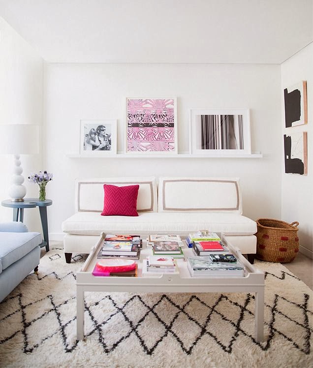
Want a small amount of hot pink?  Add a pillow.  Love the Moroccan wedding blanket-inspired rug. Eva Chen's apartment via Domino.


Love the pops of of red, pink and that orange vase in this room.

Beautiful soft gray floor and cute gray furry stool.  Images via The Style Files.

Hot pink and gray sofas look beautiful together.  Gorgeous pillows, art and ottoman.  I'd love to edit the animal skin from this otherwise gorgeous room.  Image New Home Design Ideas.


The decorator of this room has skillfully added both ethnic and metallic touches to this color scheme. The room disparate objects unexpectedly meld together to form an elegant and, yet, cozy room.  Jennifer's Pink and Lime Room via Apartment Therapy.


Another fine example of mixing disparate objects with this beautiful color scheme.  Houzz.


This room looks modern and fresh thanks to its pale gray walls and hot pink pillows. It's a sickness - I know - but I want to edit this room. I'd like to edit the grouping of artwork on the right wall.


If I had my druthers, I'd take the grouping down and move that fab graphic orange and white painting there.  That painting deserves a place of greater prominence without so much competition.  Still, it's a gorgeous room. Elle Decor France.


Simply divine pink sofa I've had in my inspiration file for a while.  I'd love to paint those walls pale gray. Via Indulgy, original source unknown.


Another beautifully soft room in pink and gray.  Ministry of Deco.


This is very close to being my dream kitchen and was the inspiration for painting my kitchen gray (see previous post here).  Wish I could paint my cupboard white!  Image via Desire to Inspire.


While exploring this color scheme, I found some accessories from a shop called Leif.  Lovely pot holder, tea towel, dipped spoons and vase would look great in the above kitchen.

Gorgeous room from CB2 catalog.  I love that hot pink end table.


New vases from CB2 in this color scheme.


This color scheme can be soft, or bold and dramatic like this room.  I adore the pops of orange, hot pink, and blue.  House to Home.


And speaking of drama, look at this bold and beautiful bedroom! I actually found this in an ad for DNA kiss portraits, but it was the bedding and those fab lamps that caught my eye. I am drooling over those lamps, if anyone knows the designer of those lamps, please contact me.

That's a wrap of my favorite color scheme for 2013.  In my next few posts, I will be talking about what 2014 is going to look like.  We are going to continue to have fun with color.  Happy New Year!

Saturday, June 29, 2013

My Apartment for Today

Spent my Saturday cleaning, rearranging and organizing.  This place is finally starting to feel like a home.  It takes a while.  Felt like lightening up.


I'd like to have the legs cut on my Parsons end table, to lower its scale.  If interested in the boring details, see post below.  More pics tomorrow.  Hope you are enjoying your Saturday as much as I am enjoying mine! xo

Thursday, June 6, 2013

Fabulous Color Scheme: Pink and Orange

So my girl Haley and I were on the phone the other day.  I was rambling on about color.  One of our favorite topics.  We often default to this topic when things get too heavy and we need cheering up.  She asked me, "How much do you think we talk about color?"  My reply:  A LOT, of course.  If you've been reading this blog for a while, you know that I am addicted.  I have experimented with many color schemes, but there is one that never fails to make me happy.  Pink and orange.  It's divine!


Genie vase at inmod;   fluo vase via hunting and collecting;   pink vase via modani;  Kate Spade Camelia Avenue posy vase via houzz.


Beautiful pink gown by Monique Lhuillier;   essential outfit for this summer, gorgeous shades of orange and coral by Matthew Williamson;  pink sleeve via sexy queen.


Orange and pink color blocks!  Image via Lonny.


Hot pink also looks great with red, as this fabulous lady proves.  Image via Coco Lee.

I am obsessed with this bedding!  That pink and orange pillow pops nicely against the black and white graphics.  Paola Navone for Anthropologie.

Friday, April 12, 2013

A Perfect Accent Wall

The next place I move to will definitely be a place that I can paint.  I am jonesin' to paint one or more accent walls!  This fuchsia corner accent wall is the perfect color!  I am saving this picture so I can take it to Home Depot and have the paint custom mixed.  I love color so much, but I'd love to live in a place that is all pink with lots of white.  The softness of the curtain looks so beautiful with that color.

And oh yes, I believe I've mentioned one or a million times before that I want white floors!  Image via House to Home.

Saturday, April 6, 2013

Thrifting

Ahh.  I love my apartment.  I love Saturday morning.  I love puttering around my apartment.  I have some new goodies from thrifting yesterday that I'd like to share.

.
New floor mat that I got at the dollar store (for $1.00)!   I'm not usually attracted to patterns, but this looks like a gorgeous water color.  I almost hate to stand on it, but my back had been hurting while washing dishes.  This solves that problem, which makes it even more beautiful.  Beauty and function.

Funny, I thought for sure I was going with pink and yellow for Spring.  For some reason I have been very attracted to blue.  I got this beautiful blue glass vase at the thrift store for $1.00!  I love art glass almost as much as I love ceramic.  I also enjoy mixing the two. The little pink tea light holder was ten cents!  These pieces look so ethereal in the sunlight, I cannot capture it with my camera.
Look at this scarf!  I almost had a heart attack when I saw it.  Now that is what I call orgasmic pink.  Only $2.00! I love this color so much, I will probably have paint custom mixed at Home Depot to match it.  I want to put it on a LARGE canvas since I can't paint the walls.   So for the cost of $4.10 I updated my humble abode today, proving once again that beauty and style don't have to cost a lot.  If it's your home, you should love it!  What about you dear readers?  What are you doing today?  I hope you are enjoying your weekend.  xo

Wednesday, December 5, 2012

Gratitude, Part II: My Apartment and Simplicity

As I mentioned below, I have many things to be grateful for.  Every day when I wake up, I thank the cosmos - the universe, or God (whatever you wish to call the miracle of creation) - for my apartment.   And every night when I put my head on the pillow, I thank the cosmos for my apartment.  It's small, noisy and humble. And I love it. My personal space is important to me, I prefer the peace and quiet of living alone.  Don't get me wrong, I have a lot of family and friends I love spending time with.  But I also love lots of solitude.  I adore living drama free. Over the past few years, as you know, I have been purging and simplifying.  I've gotten rid of many things and toxic relationships. I made a discovery along the way.  The more simple I make my life, the more content I feel.  I still love beautiful things, just not too many.  Clutter won't do.  I still adore minimalism, so I hope to achieve a flirtation with it.  Minimal and cozy sound like opposites, but they're not really.

I love simplicity.  Mid century modern is my favorite style of all time.  MCM's clean lines make it easy to layer many other styles on top of it.  Lately I've become interested in layering organic touches in my home.  I've been seeing many bloggers do this skillfully (perhaps the subject of a future post).  I particularly like layering Asian, Moroccan and industrial touches.  I want it to be girly - so hot pink must be prominent.  But, I don't want it too sweet.  Girly and a little edgy too.  Tall order.  The twist is it must be done with almost no  money.  Every now and then my mom gives me a little money (thanks so much mom!) and I buy a cute vase at the Goodwill.  Even though I try to live an austere lifestyle, let's face it - the artistry of the human race is amazing.  People make many beautiful things!  Every one needs retail therapy sometimes, and I'm no exception. The Goodwill meets this need for me without guilt.  Each time I go to the Goodwill, I bring one or more vases to redonate.  I don't believe in storage.  If something is in storage, you don't need it.  I take something out before something new comes in.  I like to think of objects being in motion and think of my place as an art installation.  My apartment is a dynamic  experiment in color, movement, sensuality and balance.

Sorry for the over abundance of words.  Why do I do what I do?  Because I have too.  More succinctly -  I friggin' love my apartment, even though it's tiny and lacking in funds.  Just wish I could paint the walls.

Here's a new obsession for me.  Rice paper lanterns.  The inspiration for these lamps are two of my favorite designs of all time:  the George Nelson bubble lamp and the Noguchi Akari lamp (which are only pipe dreams for me).   Now I absolutely adore the Nelson and Noguchi, but I'm poor.  Even if you're poor, you need pretty stuff and thank goodness there are cheap ways to find it.  No matter how humble, your home is still your refuge.  It's where you come to recharge.  It must satisfy your aesthetics and your senses, and allow you to relax.

The hexagon shaped lantern is new from World Market and was only $5.00.  I love it!  The cheapest Nelson I could find was $269! They have elements in common with the Nelson and the Noguchi.  For example, they look great hung in multiples.  When I first hung the second lantern, I was dismayed that my saucer lamp is hanging crooked.  However, after a few days I got used to it and now I love it!  As I've simplified my life, I've also learned to embrace imperfection.  Now I'm thinking of getting pink light bulbs, if I can find them cheap.  I prefer an ambient glow.  What about you, dear readers, have you used any colored light bulbs?

Pillows are the easiest way to add pops of color and texture.  Cute and inexpensive pillows can be found everywhere.  Even at the dollar store!  I've always adored pillows.  But mixing patterns is new for me.  I love these patterns together.  My mom made the pillow in front out of a placemat.

Another of my obsessions is painting vases.  I love finding abandoned, unloved vases at the Goodwill and giving them a new life.  I painted the blue vase on the bottom shelf recently, but forgot to take a before picture.
Here's what my living room looked like a few days ago.  All the hot pink makes me so happy!  I would paint the walls pink if I could!  Never too much pink for me.

I washed the pink sofa cover today, so thought I'd change the room a little.  Here is how it looks with a white sofa cover and white rug.  I like this look too.  If I had money, I'd probably do something drastic like totally redo the room in silver and gray.  Just because you live simply and with budgetary constraints, doesn't mean you can't make your home a stylish retreat.  Feel free to contact me if you'd like a consultation on simplifying and organizing your home.

Thursday, November 1, 2012

Room for Color

Did you follow this year's Room for Color contest at Apartment Therapy?  I did, and I must admit that my favorite rooms all featured pink in one way or another.  Here's a peak at my favorites. 

I love this bed, bench and bedding.  The color scheme of white, gray, pink and gold is stunning.  I also love the edginess added by the cowboy boots.  I'd like to see a more sophisticated and gentler piece of art behind the bed, though.  It's just my humble opinion, but I think spin art looks a little juvenile.  Rohde's Energetic & Inspiring Room.


As you know, I'm not a fan of animal hide rugs, but I do love the use of color in this room.  I especially adore the large red art on the pink wall.  Monique's Design Detours Room.

This room needs a little work, but is well on its way to being glamorous and sophisticated.  This is one of my current favorite color schemes:  hot pink, gray and silver.  I'd love to see larger artwork behind the sofa, and the styling with the tray is a bit odd, but gorgeous colors nonetheless.  Lisa's Pink Glam Room.

I love this room, although it could use a little editing.  I'm not a big fan of wallpaper.  Even though it's popular right now, I'm not sold.  I know I'd get bored of it quickly.  I do love the pale blue sofa with hot pink pillows, and the hot pink head dress on the wall.  Also love that hanging light.  All in all, a beautifully fresh room.  Dagny's Energetic Mix.   The following room is a bonus.  It was not part of the contest, but is a beautiful use of color.

Love hot pink and blue together.  Love the blue lamps!

Love the blue dresser and the texture added with the Moroccan wedding blanket rug.  I'm keeping this room in my inspiration file in case I ever move into a studio apartment again.  Leila & Buff's Beautiful Beach Abode.

LinkWithin

Blog Widget by LinkWithin