Showing posts with label periwinkle. Show all posts

Friday, March 16, 2018

Mood Board Chartruese and My Virtual Reality Apartment

Dear readers, if you're like me - and I think you are, since you are reading this blog 😉 - you have design ADD. Here's a confession:  I move something in my apartment everyday. Yep, everyday. It's usually just a vase or throw pillow. Oftentimes, I see an object and want to redo my whole place around it. I know you feel me.

But few of us have the resources to redo our rooms everyday, nor do we want to be wasteful. The solution is not more money for things, more space nor more storage. The solution is to live in a virtual reality apartment. Just think, if you decorated digitally, you could create on a whim. You wouldn't have to dust or have storage. Think of dinner parties, for example. You wouldn't need to keep (nor dust) a table all year long, when it only gets used once. In a virtual reality apartment, you'd create the table to suit your needs, and when you want it. Maybe tonight you want a small romantic table, tomorrow you need something larger. You could create ala carte.  The possibilities are endless. It may sound like a pipe dream, but it's actually possible...

Sorry for the digression...So I'm at the grocery store and see a cute set. As I'm walking home, I start obsessing about this set on my focal wall.  I love the modern shapes, the small footprint, and, of course, the color.


Cute, isn't it? Part of the reason I find it attractive is it's short stature. Being only 5'2", it's seldom I find a comfortable chair. With these chairs, I can actually sit back AND put my feet on the floor - a rare and joyous experience. Another plug for VR: just imagine I take the picture, then put in my measurements, and then project the 3d image. When you tire of it, you just change the color or size with the push of a button. Or you send it back to the ether when you want something new.

So here's a wall in my virtual apartment today:


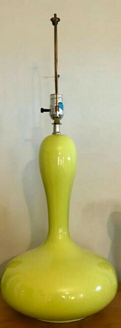
I love the color periwinkle with chartreuse, so would need a modern painting featuring periwinkle. Then a funky lamp. Painting by Artzaro. Lamp available at HaberdasheryGalore. I love that lamp, and guess what? It's 15% off!

So...I love contemplating these pieces, but don't want to spend money today, nor do I have a VR apartment, yet.  So I pulled a chartreuse vase out of my closet.


 Feels like Spring to me.


Saturday, January 13, 2018

Feeling Blue

A few of my favorite colors are: periwinkle, cobalt blue, berry pink and hot pink. Paolo Lenti is skilled at using these colors. I dropped my jaw when I saw these divine spaces.
Omigod. I love the idea of a monochromatic space, with a dark cave-like feel. These blues feel so rich, and are a great alternative to gray (which I still love, but is getting a little played out).

Reminds me a of Prada's use of jewel tones.  (See my previous post featuring one of my favorite rooms of all time featuring Prada fabrics, here.)  Dig that fabulous crochet rug by one of my favorite designers, Patricia Urquiola (another of my designed by Ms. Urquiola can be seen here). Makes me want to take up crochet again...almost. The last thing I need is another obsession. I mean, have you been down the yarn isle at Pat Catan's? It's heaven, but I know that damn yarn would sit in the closet and taunt me about how much money I've spent, lol.  Also dig that living wall, but..I have a brown thumb.

Swoon. One of my favorite color schemes.  Berry pink and light blue (see previous post here).  Their use of color is divine. If you love color, you will love their instagram page, here. Of course if I went this scheme, I would need these fabulous dishes from Urban Outfitters. Man, humans sure make beautiful things don't they?  No wonder we Americans are always broke.
Though I am totally smitten, this color scheme is not to be. It would involve too much starting over which is not possible on my teeny tiny budget. I don't need a million dollars, I need a virtual reality machine! Then I could change my decor based on my mood.  xo

Wednesday, September 17, 2014

Favorite Colors for Fall


If you've read this blog for a while, you know that I am in love with pink. It's my favorite color, always has been and probably always will be. But lately I've been conducting an an experiment in color psychology. Since I always feel hot, I am trying to make my place feel cool. I've been using a lot of blue. Totally new for me, and I've come to love it.

Blue is ethereal and makes me feel close to water - something I've always enjoyed.   I love all the shades of blue, especially periwinkle. I also love blue and periwinkle with purple, lilac and lavender.  And I love lilac with aqua and turquoise.


I also love these colors used in a Moroccan motif.


Monday, May 5, 2014

Color Story: Shades of Blue and Green

I've been falling in love with blue. But no ordinary blue, shades of blue. Turquoise and periwinkle. I've also been falling in love with green. But no ordinary green. Emerald, aqua and chartreuse. Here is some inspiration for your Monday morning. If you are feeling stressed, just think about beautiful shades of blue and green.


Love this sitting area. Chairs look beautiful with the wall color. Love the lamp too! Turquoise and aqua are colors that work very well in mid century modern decor.  Image source unknown.  Please contact me if you know the designer of this gorgeous room.


A sideboard gets a new life painted emerald green. Also love the cohesive display of green pottery. An object displayed in repetition like this gains prominence, and also maintains a simple look. Image via ciao! newport beach. For more ideas on creative display, see my pinterest board here.


How fabulous is this turquoise kitchen?  This may be my dream kitchen. Love the pop of chartreuse. Image BarlisWedlick Architects via Desire to Inspire.


I showed this picture before in a previous post about blue lamps.  Love the lamp and sofa. I want a turquoise sofa!


I need this over sized turquoise Buddha head for my balcony. Image Jessie Miller via HGTV.


Call it mint green or aqua, but this color makes a very tranquil room. I love that the trimmings are also painted the same color, and the fireplace bricks are painted white. Image via covet garden.


No one mixes color and pattern better than Tricia Guild. Touches of orange look great with blue. Wouldn't this furniture look fab in the room above?


How fab is this bohemian abode?  I dig the wood floor painted turquoise. When I build a tiny home, painted wood floors are on the agenda! Image via Moon to Moon (if you love Bohemian style, you will love this blog)..


Modern takes on mid century modern are my favorite. Periwinkle sofa and green chair look fab together and are unified by similar patterns.  Also dig that rug. Scandinavia collection at Heal's.


Periwinkle has long been one of my favorite colors. I love this chair paired with the large orange painting. BTW - that painting is done on a mirror. How cool is that? Image via The Apartment.  If you are a color lover like I am, you never get enough of periwinkle either. Check out this amazing pinterest board curated by Carole Kancar.  It's devoted to periwinkle and is a slice of heaven.


Royal blue chairs are a bit traditional for my taste, but that painting and chandelier help the room look modern. You know what I always say about art - go big! This gorgeous painting proves, once again, that blue and orange look great together. Image via Ashley Darryl.


One of my favorite rooms of all times. This is what I call perfectly layered. Love the blue sofa, with orange pillow. Love the pottery on the coffee table. Love the lamps and paintings. Love the mix of old and new, love the rugs and the gray wall. This is the home of none other than Patrizia Moroso, Creative Director of Moroso. The home is designed by one of my favorite designers - Patricia Urquiola.

Monday, May 21, 2012

Feeling Blue, Part II

There are so many shades of blue.  Baby blue, royal blue, slate blue, periwinkle, aqua, turquoise.  Here's some more blue inspiration.  No primary colors here.

Turquoise lamp and ottoman look fab with yellow table.  I need that lamp.  And that painting.  Image via HGTV.

Cool baby blue looks fab in an industrial chic environment and with pops of red.  Guilherme Torres via Desire to Inspire.
Candice Olsen's rooms always look a over the top for my taste.  But....  I must admit this color scheme of pale blue, royal blue and burgundy is delicious.
One of my new favorite color schemes.  Blue and gray.  Architects for Life.
I'm a sucker for pale blue in a modern environment.  That chair is too fab!  Sorry, I don't remember where I got this image, if you know please let me know.
Periwinkle is another of my favorite shades of blue.  This room is incredibly luxurious and restful looking in this shade.  No one does monochrome better than - one of my favorite designers - Benjamin Noriega Ortiz. 
In his own home, Benjamin lives with fabulous colors.  I've showed you his gorgeous pink bedroom (see previous post here).  The walls of his living room and dining room are painted the most beautiful of blues - Tiffany box blue.  This color is obsessing me.  I wish I could paint my walls this color!  Image via Knstrct.

Sunday, August 21, 2011

cool blue

Blue.  I love it.  All shades of it.  Baby blue.  Turquoise.  And especially periwinkle.  Blue is fresh and clean, but it's also cool, romantic and mysterious.

These are the colors I want in my home right now.  Here's some blue inspiration.

Thomas Hawk.
Dystopos.
James Lestor.
John Du Jardin.  I love orange with blue.
Romany WG.
 Chair seen at local vintage store.  Image by Peggy.  Should've bought this one.


Above two images by Peggy from my previous apartment.  For more mysterious, romantic blue inspiration, see my flickr gallery entitled blue rooms.

LinkWithin

Blog Widget by LinkWithin