Showing posts with label display. Show all posts

Monday, May 5, 2014

Color Story: Shades of Blue and Green

I've been falling in love with blue. But no ordinary blue, shades of blue. Turquoise and periwinkle. I've also been falling in love with green. But no ordinary green. Emerald, aqua and chartreuse. Here is some inspiration for your Monday morning. If you are feeling stressed, just think about beautiful shades of blue and green.


Love this sitting area. Chairs look beautiful with the wall color. Love the lamp too! Turquoise and aqua are colors that work very well in mid century modern decor.  Image source unknown.  Please contact me if you know the designer of this gorgeous room.


A sideboard gets a new life painted emerald green. Also love the cohesive display of green pottery. An object displayed in repetition like this gains prominence, and also maintains a simple look. Image via ciao! newport beach. For more ideas on creative display, see my pinterest board here.


How fabulous is this turquoise kitchen?  This may be my dream kitchen. Love the pop of chartreuse. Image BarlisWedlick Architects via Desire to Inspire.


I showed this picture before in a previous post about blue lamps.  Love the lamp and sofa. I want a turquoise sofa!


I need this over sized turquoise Buddha head for my balcony. Image Jessie Miller via HGTV.


Call it mint green or aqua, but this color makes a very tranquil room. I love that the trimmings are also painted the same color, and the fireplace bricks are painted white. Image via covet garden.


No one mixes color and pattern better than Tricia Guild. Touches of orange look great with blue. Wouldn't this furniture look fab in the room above?


How fab is this bohemian abode?  I dig the wood floor painted turquoise. When I build a tiny home, painted wood floors are on the agenda! Image via Moon to Moon (if you love Bohemian style, you will love this blog)..


Modern takes on mid century modern are my favorite. Periwinkle sofa and green chair look fab together and are unified by similar patterns.  Also dig that rug. Scandinavia collection at Heal's.


Periwinkle has long been one of my favorite colors. I love this chair paired with the large orange painting. BTW - that painting is done on a mirror. How cool is that? Image via The Apartment.  If you are a color lover like I am, you never get enough of periwinkle either. Check out this amazing pinterest board curated by Carole Kancar.  It's devoted to periwinkle and is a slice of heaven.


Royal blue chairs are a bit traditional for my taste, but that painting and chandelier help the room look modern. You know what I always say about art - go big! This gorgeous painting proves, once again, that blue and orange look great together. Image via Ashley Darryl.


One of my favorite rooms of all times. This is what I call perfectly layered. Love the blue sofa, with orange pillow. Love the pottery on the coffee table. Love the lamps and paintings. Love the mix of old and new, love the rugs and the gray wall. This is the home of none other than Patrizia Moroso, Creative Director of Moroso. The home is designed by one of my favorite designers - Patricia Urquiola.

Monday, April 21, 2014

Styling an Etagere Using What You Have

Hello dear readers, I had a great weekend with family. Hope you had a great weekend too!  In my post below, I showed you my new etagere and now I'd like to show you how I styled it. I used to find display of a collection rather daunting. The key is to use objects you love, but not too many. To strike a balance that is pleasing to your eye - and to most of all have fun!
 

This piece is a little unusual for me, because I usually go for pieces that are very slick and modern. I have been wanting Ikea's Expedit forever. But there's no Ikea locally and they don't do online business.  I worried I couldn't layer this with my more mid century pieces. And then I reminded myself that decorating a home is merely assembling a collection of things you find beautiful and useful. This piece is definitely useful and very versatile.  I almost used it my entry way to hold purses, hats, scarves, bracelets and shoes. I've been thinking of turning my entry way into a dressing room. I've always wanted a dressing room and never had one, so I just might do it. It makes perfect sense in this apartment since the bathroom is located off of the entryway. (Probably poor Feng Shui)

For now this piece is displaying some of my treasures I've collected.  Mostly ceramic.  When I considered styling the piece, I was struck by its Asian, almost island resort feel.  I don't know if it's real bamboo or not, but it's put together very well.  I've always been obsessed with the shape of Asian conical hats, and wished I had one to put on the top shelf.

Inspiration
Image via Every Culture

Image via Farscape, "Thank God it's Friday Again" (Season 1, Episode 6)

Did you ever watch the tripped out show Farscape? This image from one of my favorite episodes. It's deep, visually stunning with fabulous music. I could write a dissertation on it.  But I won't. Anyway, I think that's what started my obsession with the conical hat. And, of course, I wanted it in orange.


Maybe I could find an orange hat like the lovely lady in the photo (from a previous post here). I really dig that table too.


Hat designer extraordinaire Philip Treacy teased me with this shape on Project Runway (Season 8, Episode 4). I need to do a post about Philip Treacy's work. Remember the marvelous fascinator worn by Princess Eugenie at the Royal Wedding?  (see previous post)  I just learned that it's a Philip Treacy design.  Where could I get my hands on an orange conical hat, or even a lamp shade?


I remembered that I had seen a beautiful orange shade at The Bomb Shelter, so I quickly headed over there. Isn't this gorgeous!  It would be perfect for the top of my new etagere. It would be fabulous made into a hanging light as well. Unfortunately, it was not to be. There was actually a pair of these shades for $90. I only needed one and that price is too steep for me. The owner of the shop was not to be persuaded otherwise. As I drove home, I must have something I can use at home to mimic this shape.


I walked in the door, and there it was!  Of course, I can use the rice paper lantern hanging in my living room. It's close to the shape I was looking for and since it's made of rice paper, has the perfect amount of Asian feel to it.


It now holds a place of prominence atop my etagere, which causes yet another obsession. Perhaps I need to take a trip to World Market to buy a couple of other rice lanterns. And okay, it's not orange, but I used an orange pot from Vietnam on the bottom shelf.


This is my first attempt at displaying some of my collection of vessels.  I do love it, but it looks a little cluttered to me.


Second arrangement with oh joy! ice bucket on bottom shelf.  Love it.


Third and current arrangement. I am having fun with boutique style! It pleases me that my favorite pieces are displayed. I sold most of the pieces I had in storage.  As you know, I worry about having too many things, so I am trying to keep only my favorites that are currently on display. If it's in storage, you don't need it!  Ah, the problems of affluence.  One thing is for certain about human beings.  They sure make beautiful things.

Some New Things in My Apartment

Since I've been so remiss in blogging, there's a bunch of cool new stuff in my apartment to show you. I think I have design ADD. I change something literally everyday, even if it is just moving a vase or changing pillows. In decorating - just like in fashion - I believe accessories make the room (or outfit). I love changing my accessories. As you know, I'm super cheap, so when I want something new - something old goes out. I sold some vases that were collecting dust in my closet.

Over the years, I've dreamed of owning my own shop. When I got tired of a piece, it would go into the shop. It's the ultimate in recycling!  And there's nothing more fun than sculpting a vignette with vases.

Inspiration


When I saw this lovely home, I almost had a heart attack.  Pomona's Boutique-Style Space via Apartment Therapy.  Of course!  Boutique Style!  I could create a boutique in my home.  I dearly love beautiful objects, but I have several rules for the use of objects.  To be beautiful is not enough, they must also have a function. This is why I love pottery, tea pots, dishes and candlesticks.  Also, display is as important - if not more so - than the collection.  Beautiful objects must have room to breathe, and not compete with each other. Clutter just won't do. I love how Pomona has gone vertical with her collection of beautiful objects.  A quick word about yellow.  Is that yellow vase just too fabulous or what?  I want it!  Pomona is very smart in her use of yellow.  A little yellow goes a long way.


Pomona spoke of her treasures as being things she collected during her travels. I felt a little wistful when I read that. I think I'm catching the travel bug. Then I realized - I also have treasures collected from my travels.  Okay, my travels mostly consist of traveling Northeast Ohio, but hey, I've still collected some lovely vessels. This is a big step for me. I decided to admit that I am a collector (shudder!). So my lovely collection needs proper display. I knew I wanted to go vertical. After much consideration, I got this lovely piece from Land of Plenty. I got a great deal on it, the delightful owner cut me a break since I blogged about her shop. I had a lot of fun considering this piece, I measured the piece and measured the space and plotted my display - just like a real designer!


Look at this fabulous score!  I got this lovely vintage Indonesian batik from The Bomb Shelter. Of course I got it on the stupid cheap. It's large and it's framed. Heck, a frame of that size could cost $100. I love it! My place is kinda taking on an island resort look that I think is cool. I think it might also be maturing a bit. I want to make old lady chic a valid style.


I bought this necklace at Dot's. It is so gorgeous, I couldn't put it in the drawer, so decided to display it with my scarf collection. My place is unapologeticly girly. This necklace makes me think of Stacy London, who I adore.


Here's a couple of cute little vases I got for 99 cents each at a vintage store.  I love the Asian-inspired shape of the lidded vase.


As you know, I love deconstruction, and I love using items for purposes other than they were intended. My red lamp is now functioning as a vase.  Don't worry, it's easy to turn it back into a lamp should the mood strike me. I am addicted to the genie shape!


I mostly use second hand and vintage objects in my decor, but I like to mix in something new now and then. I got this ice bucket from Target. It's part of the oh joy! collection. I love the color, although I wish it were a little more peachy.  You have to be careful when using coral or salmon color as too much can look to fleshy. Originally I bought it because I needed something to store my curlers in, but it's too cute for that. It has a place of prominence on my new etagere. I'll be showing you the styling of my etagere in my next post.

Wednesday, November 6, 2013

A little bookcase, a story of OCD and coming full circle

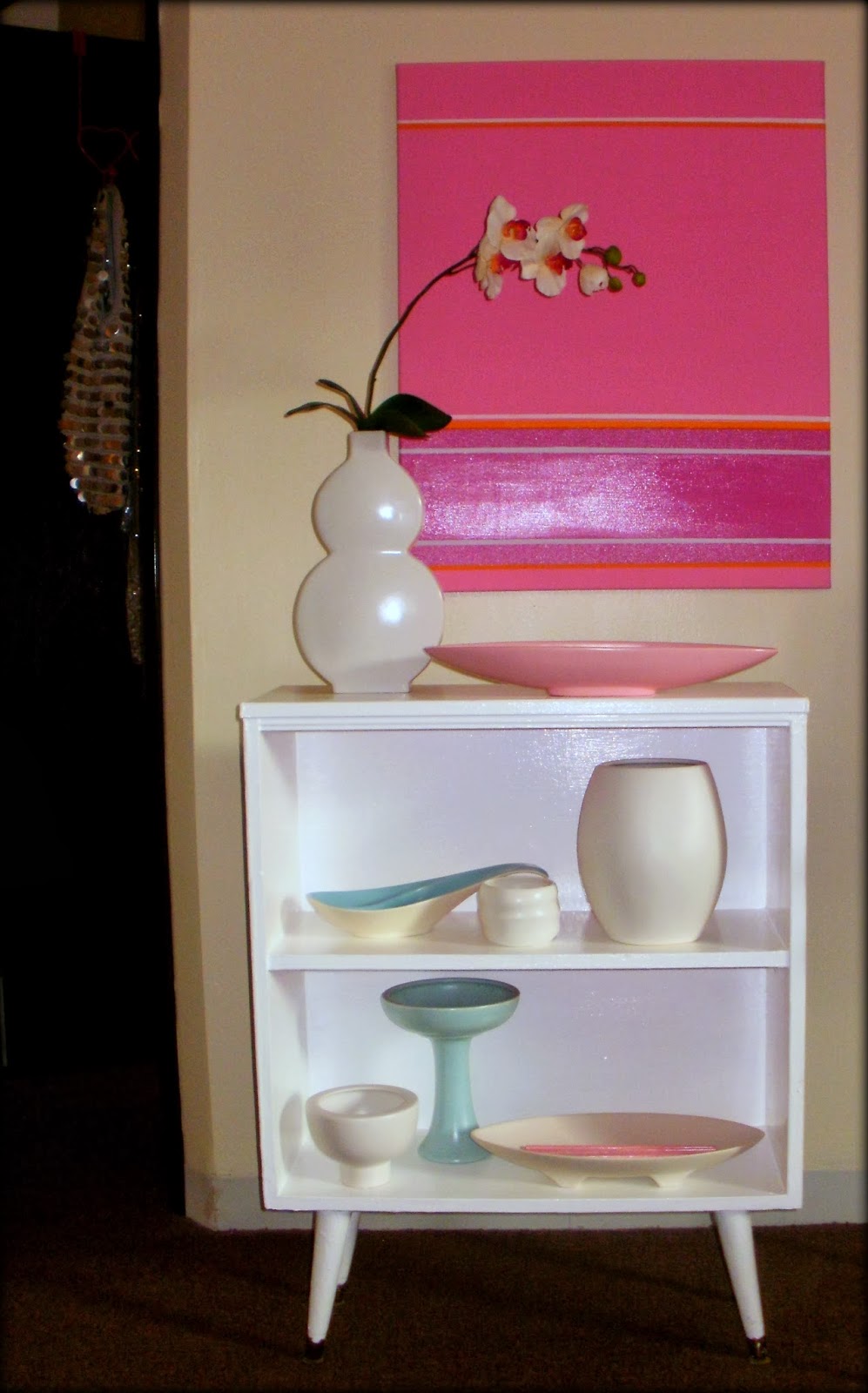
I have a little bookcase.  I've had it for years.  Bought it on the cheap at a thrift store.  This little bookcase has been many colors.  When I first bought it, it was a dull beige.  I gave it a coat of white paint, and a new life. It's a versatile little bookcase, the legs can be taken off, put on straight up and down, or at an angle.  It's been many colors.  Some of the colors predate the digital age, so pics are not available.  It's been royal blue, chartreuse, pink, and gray.  Now it's white again.  Here's its current look:

NOW

It took me a long time to arrange the pottery.  I wanted the display to be perfect.  Simple shapes, and matte finishes. I still believe that Nirvana can be achieved by achieving the perfect look and then living with it. I'm going to try living with this arrangement, appreciating its beauty and letting go of the desire to change it. I'm going to try.  For the moment, laying on my sofa and contemplating the shapes and colors makes me very happy.

THEN

Here are a few of its previous incarnations. Sometimes I still dream of owning a shop.

It started out white.


Then I made a drastic change to high gloss hot pink.  This color still makes me swoon.  I painted a canvas to match.  A great solution if you are unable to paint your rental space.


These pictures are from my studio apartment in Cleveland.  I loved that little apartment.

I've had to sell pottery during some of my periods of unemployment.  I'm grateful I was able to do that, but I miss this pink dish and the blue vase.  Ah well, c'est la vie.


For a while the bookcase was gray.  These pictures are from my attic apartment in Cleveland.  I miss Cleveland.

I love this gray color.  It was a perfect Behr custom mix.  The skilled technician matched a pillow I took to the store.  Sometimes I wish it were still gray.


Then I went for a flat bubblegum pink.


These colors still shock me, but I do love them.

In my little apartment in Akron, the bookcase still wore the bubble gum pink for a time, but it was clear it needed a new identity.


I love painting cheap vases from the Goodwill, but have had to take a break from painting.

I started getting restless.  The bookcase needed a new identity.  I thought about using it in the kitchen, and took the legs off.
I thought about using it to display some cute teapots.  The painting would have had to go.  I still like this idea, but scrapped it.
I decided to return to white.  I love color, but in an identity crisis, I always return to white.  I loved dipped legs, so experimented with making the legs hot pink.  I've never really been one for embellishments, and prefer things simple.
So white it is!  It could use some sanding, and another coat.  But the high gloss white (Behr of course) looks great to me.  At this point, only half the battle is complete. Now to accessorize. I like this look, but it wasn't quite right.

This was a fun experiment with some super cheapo pieces from the Goodwill, but I dismantled it as soon as I photographed it.  It's not simple enough for my taste.


What if I add a cute little faceted black lamp I have in the closet?  Yuk.  That's what.


So here's its current look.  I love it!  I bought the beautiful pink dish from JunkHouse. It really set the tone for the display.  After I got that piece, my collection sort of upscaled.  I was no longer interested in anything that looks mass produced, or too new. The matte finishes make me swoon!  I've been really working hard on my apartment, stay tuned for a full reveal.

Here's the details of this display, if interested:  

First row, left to right:  white stoneware vase from Z Gallerie's, physical store in Westlake before they closed.  Haven't been as happy with their internet business.  Painting one of my own.  Vintage pink atomic dish from JunkHouse.

Second row, left to right:  vintage aqua dish purchased at Sweet Lorain in Cleveland, Buddha cup by Donna Karan and the bulbous vase is from TJ Maxx believe it or not!  It's a stunning vase, perfect execution, perfect matte finish.  I only saw one, and I've never seen another like it, it must be a replica.  But every now and then you can find something mass produced that doesn't look mass produced. 

Third row, left to right:  bowl from ASA Selection, it's one of my favorite pieces of all time.  This bowl sings when you run your finger around the lip.  Haeger vintage candy dish.  Vintage California pottery purchased at Sweet Lorain in Cleveland, beautiful matte finish, beautiful legs. 


LinkWithin

Blog Widget by LinkWithin