Showing posts with label color psychology. Show all posts

Friday, January 26, 2018

My Apartment - For Today

It's taken some time, but my apartment and I are having a love affair. My personal space is very important to me. Here's a quick peek at how she looks today.


I love color, especially pink.


I'm a big proponent of color psychology. I got the knock off Middle Kingdom vase at a thrift store for $4.00. If you need cheering up, try a pop of yellow.


The chandelier is a work in progress.


Yep. I've got vase addiction.

Sunday, January 14, 2018

And the winners are..

After much deliberation, these are my favorite colors du jour.  And, oh yeah, if I haven't said it a trillion times...I love color blocking.

Saturday, January 13, 2018

My Humble Abode, Part 3: Contemplating Color

I obsess about color all the time.  For me color is a meditation, and my home is a lab. I think it was Vincente Wolf who said a room without color is a lost opportunity. I wholeheartedly agree. I got addicted to color when I discovered the work of Tricia Guild. Here is an early version of my place where I was contemplating turquiose. My lovely pillow (and very reasonably priced) from Burlington Coat Factory taking the lead.  Pillows are a great way to experiment with color without much investment.


That's just a blanket on the floor, still contemplating a rug. With tuquiose and/or aqua on my mind, I thought about buying these lovely things from Flower Child.

Luckily, I don't do much impulse buying. If I see something lovely I take its picture. Sometimes this satisfies the urge, and I don't need to buy the piece. Digital collections are the best; they take up no space and require no dusting. Sometimes a piece haunts me, as was the case with this vintage bowl. Not sure who the manufacturer is, kinda reminds me of a McCoy Floraline. I am a sucker for a matte finish.

So, I had to go back and get it.  No buyer's remorse here. It's gorgeous! Looks great with pink and only cost $6.00. I had to spend $12 (round trip) on Lyft to get it, lol.  $18 is still a good price for this lovely. And I love patronizing local business, and meeting Lyft drivers, making it a win all the way around.

Life is good.  xo

Thursday, May 26, 2016

New Painting....Simple, but not easy

Hello dear readers!  In the last couple of posts I've spoken about the process I go through when contemplating a painting. It usually starts with a color I see clearly in my brain, and which continues to haunt me.  Lately a particular shade of blue has been haunting me. When this happens the need to express the color becomes palpable.  I don't know why I do what I do, I just know that I have to.

I humbly present the first successful painting I've done since moving to my new place. It's simple, but not easy.  In fact, the more simple the painting, the more exacting. As you know, much consideration goes into the color. Then there's the mixing of the color. Then execution. In this case, I was going for perfection, although allowing imperfection can be fun too, but that's not what I wanted to achieve here. I did not want brush strokes, nor variations in the color. Indeed, the color itself is the art. This is a great way to experiment with color psychology.

I'm going to toot my own horn here - it is too bad that I am not healthy enough to work as a professional interiors painter, because I am great at it.  So it occurred to me that I should use the same technique on a canvas that I would on a wall.

If you want a perfect, flat surface it's important to remember that a lot of paints are self leveling and look completely different dry than they do wet. I think Behr paint in flat finish is the most perfect paint there is, especially if your walls are in bad shape. And Home Depot are masters at mixing custom colors (although I mixed this color myself using paints from Pat Catans.) Wish I could say this is a sponsored post, but it's not. :) These are just my humble opinions based on years of experimentation.

The key is patience and restraint. When we are trying to accomplish a smooth surface, the natural inclination is to keep working the paint, going over areas we've already done and lobbing on more paint. Like I said, most acrylics are self leveling, so not only is this unnecessary, it  can be counterproductive. The way to accomplish a smooth flat finish is to put a whole coat on the canvas, in a thin layer. Don't go back over areas you've already painted. keep moving forward in one direction. Again bear in mind that paint looks very different wet than it does dry.

Put a thin layer on the canvas (or vase or table or whatever you are painting), without stopping and without retracing your steps. Then, patience. Let the coat dry thoroughly before applying another coat. Fortunately acrylic dries quickly. Then apply another coat, same way, sparingly, always moving forward, never back. Again let dry thoroughly. You might be surprised after the second coat dries, you might be done. In fact, I have never had to give walls a third coat, even when painting a light color over a dark.  Repeat the coats the same way until you are satisfied.  For this particulsr canvas, after the third coat dried, it was done and perfect.

I love most art, but the art that I find most aesthetically pleasing in my place is very minimal. And like I've said many times, it's simple, but not easy.


Untitled, 2016, 36" x 36", acrylic on canvas

Tuesday, May 24, 2016

Processing...

Everything inspires me when I am contemplating a painting.  I am constantly amazed at the beautiful color everywhere I look.  I bought the most awesome blue lipstick and nail polish at the dollar store recently.  I can see a color scheme of blue, pink and gray.  I also found the most gorgeous pillow at Pat Catan's, on the cheap.  I usually don't like patterns, but the colors are so gorgeous.

I've been seeing a lot of blush or pale pink in decor these days.  And for the first time Pantone selected two colors of the year, rose quartz and serenity.  I am taken with how closely these colors resemble my sky inspiration photo (below).  I even love these colors with last year's color, radiant orchid.

All these thoughts go through my brain as I think about a painting. I become obsessed with a desire to reproduce a color I see in my mind.  As I contemplate, I move things around in my place. My place becomes my color lab.

My new pillow.
Part of my scarf collection
New makeup and thick socks, such luxury!

Wednesday, September 17, 2014

Favorite Colors for Fall


If you've read this blog for a while, you know that I am in love with pink. It's my favorite color, always has been and probably always will be. But lately I've been conducting an an experiment in color psychology. Since I always feel hot, I am trying to make my place feel cool. I've been using a lot of blue. Totally new for me, and I've come to love it.

Blue is ethereal and makes me feel close to water - something I've always enjoyed.   I love all the shades of blue, especially periwinkle. I also love blue and periwinkle with purple, lilac and lavender.  And I love lilac with aqua and turquoise.


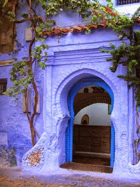
I also love these colors used in a Moroccan motif.


Friday, September 12, 2014

Celebrating Color: Blue and Orange

Happy Friday dear readers!  I have some exciting announcements coming up and am swamped with work. I know, I know... it's kind of passe these days to say how busy you are. We're all ridiculously busy.  Hey, take a break. I've got some goof off material for you. Grab your favorite coffee or tea, and let's have a color therapy session. It's good, clean fun.

I apologize that this post is hastily done. My blog is about to change directions drastically, and I have a backlog of draft posts. I want to get a couple of those done, and then make my announcements. I also apologize for the lack of links. I hope this doesn't offend anyone, I will update at a later date. In the meantime, if you are the designer (or know the designer of one of the rooms below, please leave me a comment).  However, ya'll know how to Google image search, right?  If I can do it, I know you can do it, lol.

Here's some blue and orange inspiration for your Friday. Below for your pleasure are many uses of blue and orange. There are many different hues as well.  Some rooms use a pale hue, others are saturated. Some use large amounts and others use the colors as a pop.  Some rooms use blue and orange together. The possibilities are endless. Throw in lots of white, a pop of purple or a pop of pink.  As you know, pink goes with everything.  Hope you enjoy!


Have a great weekend!  If you have insomnia, my blog will be the place to be. Lots of exciting posts coming up.  I have a couple more color posts, a new fabulous artist to introduce and very exciting news.  Stay tuned!

Tuesday, September 9, 2014

Celebrating Color: Green!

I'm one of the few people I know who are actually looking forward to Fall and Winter.  Fall is my favorite time of year. Lately I haven't been able to go outside much because the heat and I just don't get along.  But I love walking in the park in the Fall.  I love observing nature's cycles.

Our area of the globe has been lushly green because we've had a lot of rain.  I love rain, and I love grey skies. Still deciding where I'm moving - Seattle is a contender.
 Image by Peggy

I've been under the weather for a couple of weeks, I need to cheer myself up. When it comes to cheering myself up, color psychology works best. I love contemplating (and writing about color).  For the next week or so, I'll be focusing on color and will conclude with showing how I'm using color in my apartment at the moment (you might be surprised).

It seems appropriate to do a feature about green. Funny thing about green. Though I adore it outside, and am deeply in love with trees, I don't really like it much in my decor. I have used mint green, sage, aqua and chartreuse.  I'm not a fan of true green nor forest green in my home. Of course, when it comes to color in my home, I've learned never to say never. I've used orange and yellow in my home - two colors I never thought I'd use.  Still not really a fan of red in the home, but love red clothes.

I think no one can do green better than Mother Nature. Green is obviously on trend for fall.  Green accessories are everywhere. 
You are in luck if you want a green accessory for your home. Green accessories are everywhere. I took this photo at Home Goods.

Photo by personal friend of editor, not to be used without permission

If I were going to use green in my place, it would be bright green.  And of course, it would be coupled with pink. Pink looks great with everything!  I love this picture taken at the Rock and Roll Hall of Fame by my sister-in-law. Check those guitars and those bearded drums. I could design a room around this photo. Yep, bright green and pink art and white faux fur.  It would be fab.  This pic would also look cool blown up to poster size.


Designer Kristine Guico (Project Runway, Season 13) made this cute green dress for the unconventional challenge. I could design a room around this dress.  Yep, bright green and graphic vintage marquee letters.  It would be fab.
Remember the winner of Project Runway, Season 4, kid genius and designer extraordinaire, Christian Siriano?  Christian is arguably the most talented and successful of the Project Runway alumni. I've never worn green, but I'd be tempted to wear these gorgeous pieces for Fall and Winter.  Of course, they are a forest green.  I predict we will see a lot of forest green in fashion this Fall, and it will be paired with purple.

Here's a few pictures of rooms featuring green.  I love how fresh these rooms are.


This image is from an inspiration folder I started preparing when my friend Haley got a fab new place. She's an earthy kind of girl and I dig her style. Green sofa looks fabulous in this organic/industrial spot.  Love the unexpected pop of color from the pouf.  I also love me a round coffee table.  Image VT Wonen.


I love the color scheme of the pink, blue and green.  You wouldn't really call these pastel colors, nor are they exactly jewel tones.  Maybe you'd call them candy colored.  Love metallic touches as well. Fig House design by Emily Henderson.  Emily is a master at using the color green.  I adore Emily, even though our aesthetics are very different. Emily was the winner of Design Star, Season 5.  Remember her fabulous green ceiling?
 
 I miss her show on HGTV!  Oh and BTW - I just gotta show you Emily's baby son Charlie (click here).  Isn't he the cutest little guy you've ever seen!  Image via HGTV.

Emily recently designed office space for Oh Joy!  I dig that green sofa with the pink chairs.  Love the yellow and blue pillows too.  Don't really love the galley wall.  This is a big difference in mine and Emily's aesthetic.  I think it looks cluttered.  I prefer that art doesn't compete with each other and prefer one large piece.  I've written about this in previous posts, and this will also be the subject of an upcoming post.


I dearly love this bedroom.  Beautiful use of color.  Most of the room is white with pops of pink, salmon and green.  An unexpected touch is the use of the gray quilted headboard which mimics the pattern on the chair.  Love how fresh and airy this place looks.  Love the white floor!  Image source unknown.


Another beautiful earthy room.  Love the planks, love the white floor.  Love the sofa and pillows.  Hate the animal skin rug, but all in all a gorgeous room.  Nice take on lodge style.  Image Myrica Bergqvist.
 
I love this green coffee table.  You don't have to do your whole room in green, you can add just a pop.  Photo Patric Johansson for Elle Interior.


Eeeek!  My favorite sofa of all time - the Poet Sofa by Finn Juhl.  The sofa would look great in any color, but it looks particularly fab in pale green.  Love the green coffee tables, kinda look like floating lily pads. That's why I love legs on my furniture - so everything looks like it's floating.  The concrete planter is a nice touch as is the green wire sculpture.  Image via Living Etc.


Notice the sculpture behind the sofa in the above pic.  Reminds me of this green sculpture I saw at The Land of Plenty. I dig it. Would look great in a large industrial loft. Would be cool in a garden too. I didn't buy it because I 'm not making any big purchases because I will be moving soon.  More to come on that in the near future.

These art glass vases by Paola Navone would add a soft green, organic touch to a room. I was struck by these, thinking they look like sea anemones and would look great in a large aquarium.  They are appropriately named fish vases and are available at Crate and Barrel.

Here's an experiment where I was using emerald (Pantone's color of the year for 2013), in my home. I even painted the vase to match. My place doesn't look like this right now.  Reveal coming up soon, if I can ever get the place cleaned up!

After spending so much time talking about pop colors for your hair, it doesn't seem right not to include an example of green as a pop hair color.  This fab creature is sporting a fab green ponytail, yet another way to add your pop color.  It's all about fun.


Image via Teen Vogue.


For more fabulous green hair ideas, see my previous post about Natasha Lillipore here. Why not be brave and have fun with your look when you go out this fall?  Don't forget your green nail polish and eyeshadow.


What about you dear readers?  Do you love green?  Are you going to be wearing green or using green in your home decor this Fall?

LinkWithin

Blog Widget by LinkWithin