Wednesday, February 2, 2011

Cabin Fever

By now you've heard it a million times.  It's February in Ohio.  Meaning it's cold.  Very cold.  And snowing.  A lot.
Large treacherous icicles hang from my roof.
And the snow is knee deep.  Simple things like taking out the trash are almost impossible.  Chunks of snow and ice have been falling from the sky all day.  Why don't I live in Florida?  Or New Mexico?  I have cabin fever.

Fortunately I have some great coffee.  And my creativity.  Maybe being home bound is not so bad.

Chairs!

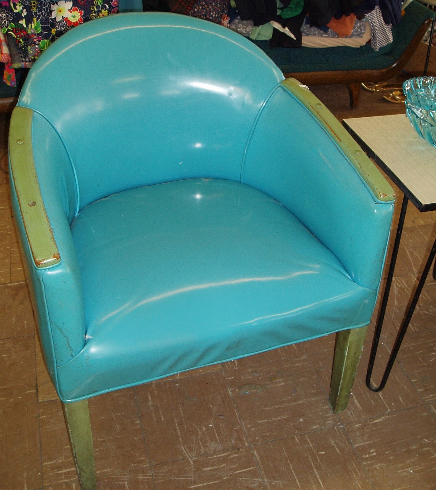
I would really love to have a new (pink) sectional in my apartment.  Since a chair is more a more affordable option (and easier to get up the stairs), I decided to go chair shopping.  I saw some really cool options.
 
This chair looks like a car seat and is really comfy.  Love the color and love the legs.  I also really adore the end table and the groovy standing lamp.

Here's another turquoise chair.  Love the color.


Dig this round chair!  I love it!
 
I love using mismatched chairs.  One of each of these would look great with my dining room table.  All above images taken by Peggy at Sweet Lorain.  If you know the designers of any of these chairs, please contact me.

Comfy recliner and foot rest at thrift store.  Price is a little steep at $325.00.

I love Jen of Made by Girl's office.  Love the white Parsons desk and the office chair.  I like the idea of having a functional chair that serves a dual purpose - comfortable extra seating as well as a good task chair for the computer.

Here is an affordable option that is similar to Jen's chair.  I saw it at Staples for $129.00.  And it's white vinyl - not leather - which is a plus.


Friday, January 28, 2011

Thrifting

Look what I found today!  Vintage Japanese watercolors, only $12.99 for the pair.  I love them!  They are 8" x 10" each.  I can't wait to frame and hang them.  Asian touches look great in just about any style of decor, but I especially love them in modern decor.

Tuesday, January 25, 2011

Feeling Blue

 Beautiful white pottery pops against blue background.  Image designspongeshop.


Here's a great idea if you have very high ceilings.  Image Solid Frog.

This room is by one of my favorite designers, Benjamin Noreiga-Ortiz from his book, Emotional Rooms.  Periwinkle is one of my favorite colors and looks fabulous with white pops from the chairs, floor and white vases.

Feeling Orange


Orange looks great with pops of white.  Beautiful orange sofa is balanced by white pillows.  Image Designers Guild.  Beautiful collection and display of white vessels pop against orange.  Images designspongeshop.

My living room - identity crisis!

Here's a peak at my living room for today. This room is just, well blah.... It's boring me.  I'm not sure what direction I want to go in.  I still miss my studio apartment.  It used to feel like a big hug when I walked in the door.  This clearly does not feel like a hug.  It doesn't help that I have no money to spend, so I'm going to have to get creative.  I think I'm craving some orange, probably because it's so darn cold out.  I need to bring some sunshine in.  My walls are this yukky shade of mauvey-biege.  My landlord doesn't want me to paint, but .... I might not be able to help it.  You've also probably noticed that I've taken my art down.  I am  bored with my art.  I'm really in a rut.  And there's only one cure for a rut.  A home improvement project!

Wednesday, January 19, 2011

Cabin Fever

I know I'm not alone when I say I've been pretty blue lately.  January is always a tough month for me.  This year is no different, the snow and the cold are really getting me down.  I've decided it's time to cheer up.  Since I'm inside more than I'd like, I might as well turn my thoughts to my favorite things.  Decor and color.  Spring is right around the corner, so it's a great time to start thinking about Spring decor.

I'm torn when it comes to my color scheme.  I've been seeing a lot of really romantic grays.  I adore it paired with lilac.  As you know, any color scheme I contemplate must have pink, and of course lots of white.  A new thing for me is that I am also adding a small pop of black.  Here is color scheme number 1:


I received some gift cards for Christmas, and here are the things I bought.  They go very well with this color scheme.
The square lilac pillow is made of the most wonderful organic, shimmery fabric.  The little teapot was carelessly broken by the store clerk, but I was able to fix it.  I want my place to be feminine, mysterious and romantic, kind of like this room I wrote about in an earlier post.

Color is not the only thing I am considering.  I want my place to feel feminine but edgy, bohemian, organic, ethnic, with some hand made elements.  I want all these things, yet I don't want it to feel cluttered.  Here are some other things I am finding inspirational at the moment.

Kim of Desire to Inspire, has been doing some interesting things in her place.  Her place seems to be in transition as well.  I love the table runner she made with doilies she died gray.  This is granny chic at its best.  Taking something ultra frilly and adding edge to it.  And check her new black lamp.  Sexy.

Here are two DIY ideas that I adore.  Both are rather casual, which I like.  I adore a certain carelessness in decor.  Lace as art over the sofa, and head board made of cardboard.  Fab!  Courtney & Trevor's Playfully Sophisticated Pad via Apartment Therapy.

I adore this pendant lamp.  It would be fun to wrap a shawl or scarf around a pendant for added romance.  Keep the furniture modern so it doesn't get too sweet.  Image via Living Etc.

I adore this hanging light from Horchow.  But it's ridiculously expensive, so not in my budget.  Why not make your own hanging lamp with wires and beads easily found at the craft store?  Or maybe even little Christmas lights all tangled up?


I'm a lover of genie bottles, and this new one from CB2 is tempting me greatly.  I also adore this pillow.  I wasn't thinking about adding orange to my decor, but this pillow might be changing my mind.

Here is an idea I love even though these aren't my colors.  Layers of mismatched curtains.  A great way to satisfy your craving for textiles.  Image Living Etc.

I think this is probably just a mock up, but you can see how lovely gray walls work with pink accents.  I love the coffee table, long low dresser and the rug.   The Bourgie lamp makes my heart stop every time I see it.  Image source unknown.


Here is color scheme number two.  Substituting hot pink and turquoise for the lilac.  I don't think I can live without hot pink.

This lovely room shows this color scheme could work.  It incorporates gray with hot pink pops, and a turquoise lamp.  Image via Desire to Inspire.


Sunday, January 16, 2011

Melissa Moss' Exciting Evolution

I adore the work of Melissa Moss.  I've written about her several times on this blog (see previous posts, here).  It is very gratifying to follow an artist's work and watch the evolution of their style.  On her blog, Melissa describes being in a "real funk" with her art.  She felt she was "cuted out" and she discovered black.  I feel a kinship with her.  I totally get the funk.  I am going through a similar process.  I am bored with my art, and I find that I love black and gray. 

Melissa's new darker paintings are remarkable.  They show the deepening of her thought pattern and a real sophistication.  I would like to have every one of them.  Melissa has taught me that you must trust the process.  A funk is not something to be feared, but part of the process toward birthing something great.  Congratulations on your accomplishment Melissa!


I want all of these!  Melissa's blog is here.  Her Etsy shop is here.

Wednesday, January 12, 2011

Celebrating Photography - Repetition

I'd like to wrap up my discussion of photography for now by discussing repetition.  Repetition of a simple image elevates it to art as this wonderful collage by flickr user CYC & Ted demonstrates.  I love the ordered nature of it.  Just the right amount of whimsy and simplicity.  I'd like to have this enlarged on a canvas.

Tuesday, January 11, 2011

Celebrating Photography - Polaroid Display

No discussion of photography would be complete without a mention of the influence of Polaroid. Polaroid is such a popular medium, that when they attempted to obsolete it, the public spoke. Polaroid is now alive and well, and new Polaroid cameras are available.


One of my favorite Polaroid artists is Sean Tubridy. I've mentioned him before on this blog, see previous post here. Sean was active in the movement to save Polaroid and founded a website called Save Polaroid.

I love his Toys on Roids series. His book by the same name, is available here. I'm thinking of ordering a copy.

I love the way Polaroid fades. I've seen many artistic uses of Polaroid including exposing it to sunlight. But it is the display of a Polaroid collection that most intrigues me and I'd like to share some photos from my inspiration file. I think there may be some ideas here for my postcard collection.

Here is a photo from Sean's studio where he has arranged his photos like a rainbow.

The Ten Cent Designer.

sfgirlbybay.Image source unknown.

Frederic's Chic & Petit in Toronto via Apartment Therapy.

Image source unknown.

Domino.
Image source unknown.

Studioilse.

Warren Heath.

LinkWithin

Blog Widget by LinkWithin