Friday, September 30, 2011

Simplicity


Hello dear readers, sorry for the lack of posts.  I don't need to explain.  You know how it is.   Life gets busy and unpredictable at times.  I have been thinking of you, and do have some exciting posts lined up and have asked blogger friend and designer extraordinaire, Jessie to do some guest posts for me, so there is fun stuff coming!  In the meantime, I thought I'd share this gorgeous room with you.  I haven't used mint green in decor since the 80s, but I adore it in this room.  Such a healing color and I love how the room is minimal and soft.  I could live in this room.  I'm craving simplicity.

Friday, September 16, 2011

Purple and Lilac

Dear readers, as you know I obsess about color all the time.  Today I'm thinking about purple.  I especially love pale lilac.
Did you see Maybelline's poster for Fashion Week?  Isn't it gorgeous?  Love the purple eyeshadow and pink lips on the otherwise black and white photo.  I could see a room done in this color scheme.  Gray walls, purple sofa, pink pillows...yum.


This purple comforter looks great with the pink bedding.

Love the bedding, the pillows and lamp.
 Above three images Julia Hoersch

Pretty lilac walls.  Love the pop from the yellow lamp.  


The always fabulous Doe Deere.  I love her dress and her socks.  If a color pleases you when you wear it, it will make a great color scheme for a room.


Mint green is one of my favorite colors lately.  Love the chartreuse coffee table, the lilac walls and the blue lamps.  Not a color scheme I'd have thought of - until now.  Looks totally fab.


Beautiful room.  Love these mint green chairs paired with the painting.

Sunday, September 11, 2011

The Cleveland Orchestra and Images of Peace

Alyssa Lee Wilmot, Akron, Ohio

Today marks the 10 year anniversary of 9/11/01.   To commemorate the event, the Cleveland Orchestra is having a concert in Public Square.  The themes of the event are remembrance, dedication and hope.  The Orchestra invited the community to submit original artwork and photos for its Image of Peace slide show which will be displayed on the JumboTron.  I am honored that two of photos will be part of this slide show.

If you'd like to my photos, click on the Shows tab above.

Thursday, September 8, 2011

Guest Blogging at Lovely Black and White


Below I described my love of black and white photography.  So I'm really excited to announce that I will be guest blogging at Lovely Black & White on Fridays.  LBW is the brainchild of blogger friend, and designer extraordinaire, Jessie.  Jessie is also the writer of My Mod Style.  I will be posting cutting edge fashion and decor photos.  Jessie does wonderful posts on Friday called a Room and a Dress, as part of Fashion Fridays.  Check them out, they are totally fun!  Hope you have a great Friday!  xxoo

Black and White Photography

I love black and white photography.  Black and white photography has remained popular even with the growing popularity of digital photography.  There is something special and arty about it. Black and white makes everything a little bit mysterious.  The mundane becomes art in black and white.  A little edge and grit are part of a black and white photo.  And let's not forget about romance.  Black and white makes even the mundane look romantic.  Whether it's avant garde, fashion photography, nature or interiors, black and white brings a whole new dimension to the work.  Here are a few wonderful black and white photos from around the web, with a few of my own photos mixed in.  Any of these would look great enlarged and hung in an all white loft.  Hope you enjoy!


Lenny Kravitz by @candyTman


 Image by Peggy


Image by Peggy

To see more of my black and white photography, click here.

My Living Room for Today

I did a little rearranging yesterday.  Rearranging is my favorite thing!  I would love to have a job doing window display.  As soon as I completed a display, I'd already be thinking of the next.  Just like my apartment.

My living room presents a lot of challenges.  It's a strange L-shape and it has to serve many functions.  It's my work area and chill area.  The biggest challenge is that I don't have any money in my budget to decorate.  I solve that problem by moving around things I already have.  My home is humble, but I love it.  I like it simple and uncluttered, and I'm learning to live with imperfection.  No matter where you live, it's your home, so it should make you happy.

In the last version of my living room (described below), I was unhappy with the balance.  The little table to the left of the sofa just isn't working.  I fixed the balance problem by moving the large lamp to the small table, and putting a larger vase on the mid-century table.  I kinda love it.  I opted for a pink slip cover.  I really wish I could paint the walls gray and the floors white.
I put my Urban Outfitters rug in front of the sofa.  It doesn't really work here.  It's too small and the color isn't really right.  I thought it was hot pink when I ordered it, but it turned out to be cranberry.  I thought about foregoing a rug here, but it looks strange to me without a rug.  It does have a lovely texture and is comfy on the feet.
I love ottomans.  They make perfect coffee tables and perfect occassional seating.  You can move them around easily.

Hmm, I like that silver pillow, but...

I think I like the yellow one better.  Every room needs a pop of yellow.  I get away with using a lot of color because I keep pattern to a minimum.


 The moon lamp and the big blue vase are from CB2.  I'm loving the large scale pottery.

Here's why I moved my big white rug.  My office area.  Every time I move the bench out so I can work, I mess up the rug.  It was kind of driving me crazy that I had to straighten the rug every time I was done working.  It's really heavy!  You know how it is being an extreme freelancer, you work like a zillion hours a day, so I was straightening the rug constantly.  That got old. 
So I moved the rug to my new meditation/yoga area of the living room.  Now my strange alcove has a real function!  I also enjoy looking at it while I'm chilling on the sofa.  I know the lighting's bad.  We were having a storm.  I really gotta give props to interior photographers, it's not as easy as it looks.

Wednesday, September 7, 2011

Processing - Weekend Art Projects, Part II

When I was writing about the Tokidoki Barbie that's coming out next month (see post below), I discovered a whole new world of Barbie furniture.  There's a lot of collectors making amazing homes, with beautiful rooms for Barbie.  In fact, at times on flickr I thought I was looking at a real room.  And I've definitely seen some homes for Barbie that make be drool.  I began to think about decorating a home for a Barbie.  My Barbie would have a large, all white loft.  She'd need a vase collection and a fab way to display it.  Maybe even open shelving to help divide the space, but keep it airy.

Barbie's Wall of Vases, 2011, 16" x 20" cut paper and markers.  I cut out little vases all based on vases in my collection and arranged them on a simple bookcase.  The best part is that they are taped, not glued, and can be moved around at Barbie's whim.

If you're interested in Barbie furniture, here's a fun group on flickr (link), and here's a cute Etsy shop (link).

Processing - Weekend Art Projects, Part I

I love minimal paintings.  They are much harder to execute than they look.  Simple is not always easy.  Simplicity demands perfection.  One line out of place and it's ruined.  I often see a simple shape and a color in my head, and I'm not happy until I can get it on canvas.  But this day I was working with paper.  With paper, it's a little different.  There is a communication with a canvas, where I become merely its conduit.  Paper also tells me what it wants to be, but in a different and more subtle way.  It must be caressed more gently, and is less forgiving of the mistakes.


Balance, 2011, 16" x 20", marker on paper.  Not perfect.  But I am digging it.  I could design a minimal room around this baby.  This baby needed a partner.  And here she is.

Balance II, 2011, 16" x 20", acrylic on paper.  I wanted to do an organic stripe.  I taped off the areas for the stripes, but honestly, I was not as caught up in perfection as usual.  I wasn't terribly concerned that the stripes be perfectly straight.  A real departure.  I messed up the side of the work when I tore the tape off.  Or did I?  At first I was disappointed.  But after sitting with the work for a while, I kinda like that bit of rawness.  I just took it as a meant to be.  Like I said, I'm just the conduit.

I was highly influenced by the tye dye rug from CB2.  I am madly, deeply in love with this rug.  But, it's not to be my darling.  Cest la vie.  I wanted to communicate something this organic in my art. 

I'm not sure whether I accomplished that, but I am digging these.  That doesn't happen too often.  Here are the two works in my hallway.  I might put them in my Etsy shop.

Processing - Weekend Vignettes and Preparing to Make Art

Dear readers, I can't believe it's Wednesday already!  Where does the time go?  I had a busy three day weekend creating art.  I'd love to share my processing and how it's going to impact my decor for Fall.  I hope you will take this journey with me.  Creativity is fun!  There is nothing I enjoy more than creating art and decorating my humble apartment.  And as you know, I do it with no money, and stuff I already have in my closet.  Let's have some fun, shall we?

I elected to create without music this time, not sure why.  Wanted the quiet, but that was almost impossible because the Blue Angels were in town for Labor Day, and flying right over my head.  It literally sounds like the sky is opening up when they fly by.  I thought they'd drive me crazy, but when I went into my art zone I was able to tune them out.  I had a minimal painting in my mind.  A shape, and a color that haunts. Still staying away from toxins at the moment, so I knew I'd have to get inventive with markers, cut paper and maybe crayons.  As you know, when I am processing I start by moving things around things in my apartment and experimenting with different vignettes.  I need the perfect balance.  To set the stage, so to speak.
 
I've been wanting to experiment with more organic touches, and I found this vase at the Dollar Store.  Yep.  I paid $1.00 for it.  I've been wanting something wood, and am really digging the idea of wooden bowls right now.  Actually, I'm not even sure it's real wood, it might be resin.  It's still kinda cool and a pretty shaped vase.  I'm not sure I like it in my space, though.  Maybe it's for Haley's loft.  Or maybe I should spray paint it white?  I really wanted these beautiful vases from Chiasso, but I didn't want to spend the money.
Aren't they gorgeous?  Maybe I can spray paint my new vase in a pearly glaze and it would look similar to these.  Oh wait.  Spray paint is a toxin.  Darn.

You know, I've never really been interested in jewelry or diamonds, although I do love costume jewelry.  I don't need fine jewels, but I love Tiffany boxes.  The color is so beautiful.  I love the way that color pops off the pink vases.  These boxes are part of an installation piece I am working on.  Installation art is madly fascinating.  The preparation of an installation can utterly absorb me and become the dominating force in my life.  It's like being in a trance, and it's pure heaven.  I need a Betsey Johnson hot pink box for this installation but - you guessed it - I don't want to spend the money.  Betsey is totally fab, though.  I've written about her on this blog several times (see previous posts here).
My sister-in-law and I recently did a Target run.  It was odd, now that I'm not in corporate America, I don't do Target runs with the same regularity.  And I don't really miss it.  Now that the Target close to my home is one of those mega-huge stores, the inventory is not what it was.  The smaller store (now closed) had better and edgier buyers.  This large store has become rather, um, homogenized.  Hate to say it.  Not really faulting them, we need design for the masses, but I think they need to step up their game a little (although I am digging these pillows they have, lamp from Habitat).  Sorry, I digress.  Anyway, the chair was on sale for $7.00.  It was great sitting on my deck tonight.  I love the cooler weather we've been having.  Fall is my favorite time of year.
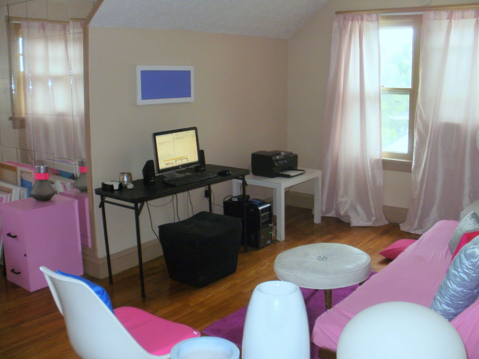
Remember my last incarnation of my living room?  This is number 16.  When I look at this picture I am bothered by the lack of balance on either side of the sofa.  That little table really doesn't work, but it will have to do.  I want an over sized lamp and some intentional distortion of scale, but I still feel like the little table  needs something larger.  Since the lamp is tall, maybe I'll move it to the small table.  It casts a beautiful, romantic glow at night, so it's probably good to have it in the corner anyway.  How to make this area look more balanced with a little table that's not really working?  Stay tuned for my next reveal. 
I went to the closet to pull out some of my vases.  Here is the new vignette on the table, but who knows how it will look tomorrow.  Now, that I have some balance, it's time to make art.

Tuesday, September 6, 2011

Some more romantic neutrals, and a whole lot of inspiration

I'm not sure why, but I have a ton of new photos in my inspiration file.  Maybe it's because I might be moving again.  Maybe it's because we will soon have a change of seasons.  Maybe it's because Fall is my favorite time of year, and that triggers the nesting instinct.  Here's a bunch of inspiration and a lot of ideas I'd like to try, hope you enjoy!


 Above two images Solange van Dorssen via Desire to Inspire

I'm all about edgy femininity.  I love a combination of the glam and the raw.  I've always wanted to experiment with a corrugated steel wall.  Love it here combined with the white slip covers, the gray pillows, the lamps and art.  The perfect pop is provided by the hot pink pillows.  Every room needs a pop of hot pink.


I adore industrial looking, purely functional bookshelves!  A bookshelf should not compete with the items it displays.  These look great in this room, they take up very little visual weight.  I adore the juxtaposition of the slip covers with the bookshelves.  Keeps the fabric from looking too frilly and gives just the right amount of edge.

 Above two images via La maison d'Anna G.

This kitchen is in the same home, and is close to being my fantasy.  I adore the subway tiles and the open shelving.  The simplicity of the dishes is the perfect foil to the edgy art.


This room is a tad overdone for me.  There's too much on the walls, and I don't care for the pattern of the drapes.  But.  Look.  At.  That Sofa!  I love it!  You already know I love me some silver.  This sofa has me up at night fantasizing about it.  It reminds me of car seats, and I can almost hear Feel Like Making Love by Bad Company.  Seriously, this thing is bringing back memories of my first kiss.


Abigail Ahern is a genius.  She always challenges my perspective, and I like that.  I like minimalism.  She's a lover of maximalism.  I like light rooms, she likes dark rooms.  In fact, it's her influence that started me loving black accent walls.  And, as you know, she's the one who got me obsessing about an over scale lamp shade.  Here she again challenges my perspective.  I'm not usually a fan of the Chesterfield sofa, but I must admit it looks great in this room.  Love it paired with the Moroccan-inspired tapestry, lamp and rug.  Dig that rug!  Lately I've been seeing a lot of rugs that appear to be made from Moroccan wedding blankets.  Divine.  Lastly, dig that tall, skinny chair.  I think it's a great foil to the sort of short, stubby looking sofa.  (BTW - Abigail's home was featured on The Selby (link)!  You go, girl!)


One thing leads to another.  Now I'm obsessing about this chair that I saw at my favorite vintage store.  It came in a set of six, but I just want one.  I love intentional distortions of scale, and I think it would look great with my low scale sofa.  Image by Peggy.


Here's an idea I'd like to use if I move into a studio or open loft.  I'd  love to use a screen/headboard like this to separate the space.  Maybe I wallpaper cardboard panels.

Sandra's Luxurious Modern in Brentwood via Apartment Therapy

Love this little seating area.  Steely blues, gray and silver, yum.  Love the Moroccan inspired tables.


This room is a little overdone for me.  As you know I'm normally not a wallpaper fan, and the mixing of the wall paper patterns is too much for me.  Especially with the tufted chair.  But.  There is something alluring about the room nonetheless.  There's a bit of edge provided by that groovy steel lamp and table to the right.  And look at that chandelier.  So romantic.


Again, this is a little overdone for me.  I don't care for groupings of photos.  The photos are pretty, but I would've preferred to see one over sized piece.  Go big with art!  It makes such an impact.  But.  Look at that color scheme.  Absolutely gorgeous.


I just can't get over gray and white interiors.  So peaceful and calming.  What do you think, dear readers?  Do you see any ideas you'd like to use in your home?  Have any of these rooms challenged your perspective?

LinkWithin

Blog Widget by LinkWithin